Navigation
-
-
Standalone Tebex Templates & themes Websites Pterodactyl Themes Addons Eggs NamelessMC Templates Modules XenForo Themes Addons Invision Community Themes Plugins Translations WHMCS Themes Modules Paymenter Themes Extensions Calagopus Themes Extensions Eggs LeaderOS themes Ghost themes Shopify themes Wix themes Squarespace themes Other webstores CraftingStore templates MineStore themes PayNow templates Other
-
-
-
Install the app
More options
You are using an out of date browser. It may not display this or other websites correctly.
You should upgrade or use an alternative browser.
You should upgrade or use an alternative browser.
Thoughts on thumbnail?
- Thread starter Zyaf
- Start date
- Status
- This thread has been locked.
PebbleHost
High performance, consistent uptime and fast support. Minecraft hosting that just works.
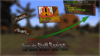
It's a bit empty, maybe add bit more stuff? Like text. Otherwise, it's gud! 
As said above, blur the background instead of using liquify. Also, crop the images a bit better. Add a slight gradient onto each layer, and then a drop shadow. Its also a bit empty, so and a player model or image in the middle.
It's a bit empty, maybe add bit more stuff? Like text. Otherwise, it's gud!
I would suggest adding like an animation of a player being frozen or the server logo.
blur the background dont use liquify
Very bland & boring, I would rate 4/10.
I've taken all suggestions into account!As said above, blur the background instead of using liquify. Also, crop the images a bit better. Add a slight gradient onto each layer, and then a drop shadow. Its also a bit empty, so and a player model or image in the middle.
Thoughts?
Attachments
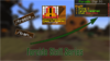
I'll see what I can do, thanks.1 more suggestion try adding outlines with white or black strokes (white preferably) to make it really pop as thats what i see in most good photoshop/text thumbnails
Its an improvement, I would definitely use the perspective transform option and play with the images and text. Also, replace the glow with drop shadows. Finally, add a gradient to the text, as it is a bit bland.
Attachments

Arrow color doesnt look good imo, make it A Bright color
The arrow is really bad...
color wise and looks wise.
Looks like it was made in Microsoft word, 2/10
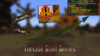
Revamped!
Attachments


3/10
WHY?
Background should be Motion Blur / Gaussian Blur / Radial Blur.
Arrow looks bad.
The thumbnail overall looks really empty.
(NO OFFENCE)
WHY?
Background should be Motion Blur / Gaussian Blur / Radial Blur.
Arrow looks bad.
The thumbnail overall looks really empty.
(NO OFFENCE)
In my opinion, (idk if this has been said or not) the bottom text really is bad. Try using a different, thicker font, don't use the glow but a nice strong drop shadow, but not to heavy. You can use just a simple white text with thick black outline + a drops hadow. Maybe add a "glow" to it, show in this example.
 Not the best example, just made it quickly. But my idea^
Either way, goodluck with your thumbnail man haha
Either way, goodluck with your thumbnail man haha
I'll add that ASAP.In my opinion, (idk if this has been said or not) the bottom text really is bad. Try using a different, thicker font, don't use the glow but a nice strong drop shadow, but not to heavy. You can use just a simple white text with thick black outline + a drops hadow. Maybe add a "glow" to it, show in this example.
Not the best example, just made it quickly. But my idea^
Either way, goodluck with your thumbnail man haha
- Status
- This thread has been locked.