


Sup gamers,
As MC-Market moves towards our XenForo 2 migration we're particularly excited about the potential for us to create a new theme to make the site look completely different. Five years ago we introduced our very first custom theme to the site which looks very similar to what the site still looks like today:

Three years ago we released the theme that we are still using today. Initially when we released it, seemingly a majority of our users hated it and wanted us to revert back, which I think is interesting because it was simply a modernisation and I figure that this time around something very likely is going to happen, especially because I want MC-Market to have our biggest design overhaul in history.
Over the past few months I have commissioned a handful of designers to make their rendition of what our resources index page could look like in a new XF2 theme designed by them, and here are the results:
None of the previous mockups has been completed and this thread isn't intended as a vote for which theme we should go with. Instead, I'm using these mockups I had created as a jumping-off point into having a discussion about what you'd like to see in our new theme. When planning for XF2 I had always envisioned that we would be able to make a design that doesn't simply look like a XenForo reskin and I'd really love to know which parts you really like from each of these mockups.
If anyone has any other websites you think could be used as inspiration for our redesign, or even wants to post your own mockup/ideas below then that would be amazing
As MC-Market moves towards our XenForo 2 migration we're particularly excited about the potential for us to create a new theme to make the site look completely different. Five years ago we introduced our very first custom theme to the site which looks very similar to what the site still looks like today:
Three years ago we released the theme that we are still using today. Initially when we released it, seemingly a majority of our users hated it and wanted us to revert back, which I think is interesting because it was simply a modernisation and I figure that this time around something very likely is going to happen, especially because I want MC-Market to have our biggest design overhaul in history.
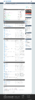
Over the past few months I have commissioned a handful of designers to make their rendition of what our resources index page could look like in a new XF2 theme designed by them, and here are the results:
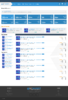
This project was started last year by Kuchy to try and modernise the site further for XF2 while still maintaining a familiar style and layout to what we have today.

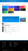
Mantas created a colourful and modern design that is a little bit less forum-like and traditional, which I think looks really great.

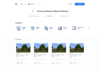
Zyrl took the idea of making the site look un-forum-ish and really ran with it with this design to create something minimalistic and modern. It's quite different to what our site currently looks like and would likely be a huge pain in the arse to actually develop, but I think that it's definitely a step in the right direction when it comes to having a new MC-Market XF2 theme made.

None of the previous mockups has been completed and this thread isn't intended as a vote for which theme we should go with. Instead, I'm using these mockups I had created as a jumping-off point into having a discussion about what you'd like to see in our new theme. When planning for XF2 I had always envisioned that we would be able to make a design that doesn't simply look like a XenForo reskin and I'd really love to know which parts you really like from each of these mockups.
If anyone has any other websites you think could be used as inspiration for our redesign, or even wants to post your own mockup/ideas below then that would be amazing
- Type
- Suggestion
- Status
- Implemented
Attachments
Last edited:



