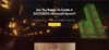
Hello! I just released a project of mine. It is a Minecraft server creation course. And I want to know your opinion on the site(landing). What do you like, what you don't like? https://mcacademy.vip/
Overall I like the look of your site, but from a design perspective I think you're wasting a lot of space above the fold. You need to capture your audience in that very first interaction on the page, so for me there's a ton of blank space below your click to pre-order button that needs to help sell you and your product, or engage me a bit more in the site. I'm also personally not a huge fan of embeded videos on the main page, I think it takes away a bit from the overall look and feel.
Good color choices, font size is correct and most of the site has a good contrast. You might try playing with the colors thou on the yellow section, that can be a bit hard to focus on with such a bright yellow background.
You have the design idea right, but in my opinion, the execution isn't the best (or maybe just not to my liking), considering the high-level developers have put up these days. It's very clean and straight to the point which is what you would want, not over bombarded with information and is quite appealing to the eye, making me want to read more.
I'm no professional with website design but personally I don't like the background image of the city. It would look better if it was just a shot down the road. Also, I believe the glow stone can be changed the red stone lamps and I don't like the green part to the right.
Also, I find the yellow part very blinding and would remove the massive spaces in some parts.
This site uses cookies to help personalise content, tailor your experience and to keep you logged in if you register.
By continuing to use this site, you are consenting to our use of cookies.