2019 Charity Fundraiser Colour Vote

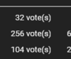
Which colour should we sell in our next fundraiser?

  • Option A - Orange to Lime

  • Option B - Pink to Orange

  • Option C - Green to Lime


Results are only viewable after voting.
Status
This thread has been locked.

jxhdvn

The Visionary
Supreme
Feedback score
30
Posts
2,480
Reactions
1,282
Resources
0
While this colour does look really really nice, something very similar was offered in our staff chats for a “fire to ice” colour. Ultimately I said that none of our colours are going to include red for the gradients, it’s far too close to being the staff colour.


Problem with greys is that they don’t stand out, and would be difficult considering we have light and dark themes for the site. I also don’t want to give one charity colour more bold (or an outline) than the other ones and do like consistency with it.


The first colour looks like a slightly more extreme version of C, except it’ll be really hard to read on light theme.

The second option is just our special effect username colour from our fundraiser not last time, so we can’t do that again.


We currently have a tonne of name colours involving blue, I’d rather we pick a colour that we haven’t added much before.

We have premium blue, dark blue, water.org blue, and cyan.

The same is also the case with purple/pink I guess.

I’m pretty sure we tried blue to orange, it looked horrible every time.


Very cool!


The first one is red, so we’re not doing it. The second is too similar to our water.org and make-a-wish colours.


Considering the restraints we have with colour picking, like having to make it suitable for light/dark, not include red or other common colours, not be too similar to our current colours, not be too flashy, I think we did a pretty good job with it. We spent a lot of time in the staff team brainstorming colours and although some are more liked than others (Justis), we’ve not really got any other options other than the ones I’ve listed.

If you’ve got some hex codes to give me then I’d love to see what amazing gradients you can come up with :).
blue-pink-linear-gradient-1920x1080-c2-6495ed-ffb6c1-a-0-f-14.svg

linear-pink-green-gradient-1920x1080-c2-90ee90-ffb6c1-a-0-f-14.svg
 

BOOP

Director of Ops @ Zelphra
Supreme
Feedback score
23
Posts
2,384
Reactions
1,095
Resources
0

Attachments

  • upload_2019-6-19_18-30-31.png
    upload_2019-6-19_18-30-31.png
    2.4 KB · Views: 116

Red

Chromatic Polymath
Supreme
Feedback score
34
Posts
1,251
Reactions
632
Resources
0
Looks like all of our previous suggestions won't work for some reason or another, but I absolutely LOVE both of these. Pink to blue and pink to green.

The pink to blue is just a more subtle version of that "fire and ice" color Mick mentioned, just without the red.
I was going to suggest red to green (before Mick said no red), but thought it might be too loud. Your pink to green is perfect!
 

ShowUp

Expon Corporation
Supreme
Feedback score
38
Posts
506
Reactions
290
Resources
0
If you've got any ideas for gradients I'd love to see them so I can add them to the poll
qqurjw4.png
Orange to hot pink
NBBmddO.png
Orange to purple (red looks nicer but you said no red)
 

ShowUp

Expon Corporation
Supreme
Feedback score
38
Posts
506
Reactions
290
Resources
0
The second one is basically the same as option A, the first one is really great though.

Maybe I’ll make a new poll between option B and that one once this one ends.


The colours are too vibrant to fit in imo.
upload_2019-6-20_0-6-45.png
[DOUBLEPOST=1561003633][/DOUBLEPOST]Also red shows default for unranked user's name if you select it as secondary color[DOUBLEPOST=1561003676][/DOUBLEPOST]
upload_2019-6-20_0-7-41.png

upload_2019-6-20_0-7-52.png
 

Attachments

  • upload_2019-6-20_0-6-45.png
    upload_2019-6-20_0-6-45.png
    2.1 KB · Views: 101
  • upload_2019-6-20_0-7-41.png
    upload_2019-6-20_0-7-41.png
    80.3 KB · Views: 105
  • upload_2019-6-20_0-7-52.png
    upload_2019-6-20_0-7-52.png
    52.7 KB · Views: 106
Last edited:

Red

Chromatic Polymath
Supreme
Feedback score
34
Posts
1,251
Reactions
632
Resources
0
the first one is really great though.

Maybe I’ll make a new poll between option B and that one once this one ends.
YES! Please do, pink to blue would be incredible.
 

Spyow

Google Ads Expert
Supreme
Feedback score
14
Posts
118
Reactions
87
Resources
0
The first colour looks like a slightly more extreme version of C, except it’ll be really hard to read on light theme.
234979

Mick That's it on light theme can read it fine :eek:
 
Last edited:

Desert

7 years
Supreme
Feedback score
81
Posts
974
Reactions
678
Resources
0
a cotton candy (pink and blue) type would be amazing. how would a black to white look? just wondering. also are you bringing back the rainbow one by any chance or? Mick
 

Red

Chromatic Polymath
Supreme
Feedback score
34
Posts
1,251
Reactions
632
Resources
0
how would a black to white look?
Could someone “render” a model of this out on dark and light theme? I want to see if it really is hard to read without an outline.
 

Desert

7 years
Supreme
Feedback score
81
Posts
974
Reactions
678
Resources
0
Could someone “render” a model of this out on dark and light theme? I want to see if it really is hard to read without an outline.

i know maybe a black and white version probably won't work, but it'll still be nice to see how it could look.
 

Sloth

Feed Me
Supreme
Feedback score
6
Posts
4,369
Reactions
2,660
Resources
0
i know maybe a black and white version probably won't work, but it'll still be nice to see how it could look.
If the colors were bright enough it would actually look pretty badass. My only concern would be light theme unfortunately.
 
Status
This thread has been locked.
Top