Navigation
-
-
Standalone Tebex Templates & themes Websites Pterodactyl Themes Addons Eggs NamelessMC Templates Modules XenForo Themes Addons Invision Community Themes Plugins Translations WHMCS Themes Modules Paymenter Themes Extensions Calagopus Themes Extensions Eggs LeaderOS themes Ghost themes Shopify themes Wix themes Squarespace themes Other webstores CraftingStore templates MineStore themes PayNow templates Other
-
-
-
Install the app
More options
You are using an out of date browser. It may not display this or other websites correctly.
You should upgrade or use an alternative browser.
You should upgrade or use an alternative browser.
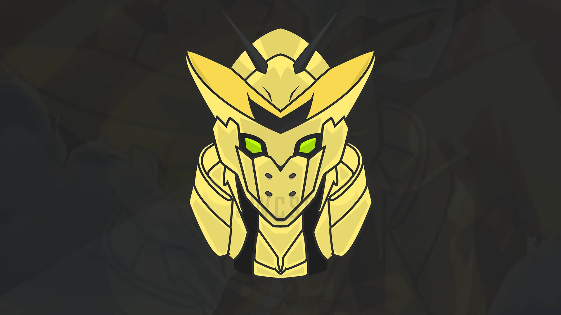
2nd mascot attempt. feedback/criticism plz
- Thread starter Ncsg
- Start date
- Status
- This thread has been locked.


PebbleHost
High performance, consistent uptime and fast support. Minecraft hosting that just works.

Hey I see you’re starting mascots. A few things I’d say you can improve on. Firstly, the colouring is not precise, try and imagine a light source coming from a direction and get the feel of where you put your highlights/shadowing. Secondly, If you’re going to make mascot themed logos, make the lines so much thicker as of course that’s the style. Other than that, a good 2nd attempt.
Not that bad. The main issue I see here is the colouring tbh.
I like it, good job. Practicing will always pay off!
- Status
- This thread has been locked.
