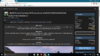
Hey guys, so this is a simple change that I think would overall make the site look better. Currently (If you are on dark theme) when you purchase a resource after everything goes through and whatnot you are prompted with a download button, however, on the dark theme the text is a dark grey like so,

We should change the text inside the box to a white to make it much easier to read.
We should change the text inside the box to a white to make it much easier to read.
- Type
- Bug report
- Status
- Implemented