Navigation
-
-
Standalone Tebex Templates & themes Websites Pterodactyl Themes Addons Eggs NamelessMC Templates Modules XenForo Themes Addons Invision Community Themes Plugins Translations WHMCS Themes Modules Paymenter Themes Extensions Calagopus Themes Extensions Eggs LeaderOS themes Ghost themes Shopify themes Wix themes Squarespace themes Other webstores CraftingStore templates MineStore themes PayNow templates Other
-
-
-
Install the app
More options
You are using an out of date browser. It may not display this or other websites correctly.
You should upgrade or use an alternative browser.
You should upgrade or use an alternative browser.
Feed Back | Website Profile Page
- Thread starter IAmVolvic
- Start date
- Status
- This thread has been locked.

PebbleHost
High performance, consistent uptime and fast support. Minecraft hosting that just works.
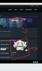
It’s defintely nice. I would only suggest filling some of the empty space, for example I feel like the XYV side could be pushed further to the right. Also perhaps center or make the description a little bit bigger other than that I think it’s pretty nice good job ")
I have no idea what to put there lolIt’s defintely nice. I would only suggest filling some of the empty space, for example I feel like the XYV side could be pushed further to the right. Also perhaps center or make the description a little bit bigger other than that I think it’s pretty nice good job


- Status
- This thread has been locked.