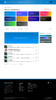
Feedback and Mockups for the MC-Market XF2 Theme

Status

Mick

BuiltByBit Owner
Management
Feedback score
28
Posts
6,413
Reactions
7,704
Resources
0
Sup gamers,

As MC-Market moves towards our XenForo 2 migration we're particularly excited about the potential for us to create a new theme to make the site look completely different. Five years ago we introduced our very first custom theme to the site which looks very similar to what the site still looks like today:

FireShot Capture 014 - MC-Market - www.mc-market.org.png

Three years ago we released the theme that we are still using today. Initially when we released it, seemingly a majority of our users hated it and wanted us to revert back, which I think is interesting because it was simply a modernisation and I figure that this time around something very likely is going to happen, especially because I want MC-Market to have our biggest design overhaul in history.

Over the past few months I have commissioned a handful of designers to make their rendition of what our resources index page could look like in a new XF2 theme designed by them, and here are the results:

This project was started last year by Kuchy to try and modernise the site further for XF2 while still maintaining a familiar style and layout to what we have today.
Resources - Light.png

Mantas created a colourful and modern design that is a little bit less forum-like and traditional, which I think looks really great.
Screen Shot 2020-08-01 at 6.12.21 pm.png

Zyrl took the idea of making the site look un-forum-ish and really ran with it with this design to create something minimalistic and modern. It's quite different to what our site currently looks like and would likely be a huge pain in the arse to actually develop, but I think that it's definitely a step in the right direction when it comes to having a new MC-Market XF2 theme made.
resource-3-2.png

None of the previous mockups has been completed and this thread isn't intended as a vote for which theme we should go with. Instead, I'm using these mockups I had created as a jumping-off point into having a discussion about what you'd like to see in our new theme. When planning for XF2 I had always envisioned that we would be able to make a design that doesn't simply look like a XenForo reskin and I'd really love to know which parts you really like from each of these mockups.

If anyone has any other websites you think could be used as inspiration for our redesign, or even wants to post your own mockup/ideas below then that would be amazing :)
 
Type
Suggestion
Status
Implemented

Attachments

  • Resources - Light.png
    Resources - Light.png
    727.7 KB · Views: 1,208
  • Screen Shot 2020-08-01 at 6.12.21 pm.png
    Screen Shot 2020-08-01 at 6.12.21 pm.png
    289.6 KB · Views: 1,206
  • resource-3-2.png
    resource-3-2.png
    218.3 KB · Views: 1,225
  • FireShot Capture 014 - MC-Market - www.mc-market.org.png
    FireShot Capture 014 - MC-Market - www.mc-market.org.png
    1.2 MB · Views: 1,178
Last edited:
PebbleHost
High performance, consistent uptime and fast support. Minecraft hosting that just works.

Rhos

Graphic Designer | Rhos#8740
Premium
Feedback score
7
Posts
179
Reactions
190
Resources
0
Mantas 100%. Could use a little polish but from a UX/usability perspective it's perfect. Simple, uncluttered and intuitive.

I'm especially a fan of the featured/recent/top tabs, it's a much more elegant solution than cramming everything into a corner, and everything's accessible with a single click. Also low-key liking the colour-coding of the different categories, makes differentiating between them far easier than with similarly styled icons.
 

Tommy W

Professional Noddle
Deactivated
Feedback score
31
Posts
974
Reactions
475
Resources
0
Zyril's theme.
it looks super gamer.
 

aMango

Supreme
Feedback score
4
Posts
0
Reactions
98
Resources
0
Zyrl's theme for sure, not that the other themes are bad, but I prefer something more modern and visually appealing.
 
Last edited:

MrVibe

Website Designer
Premium
Feedback score
23
Posts
71
Reactions
54
Resources
1
Zyrl's theme, I like minimalism :) Maybe add a poll in the thread? That will be helpful :)
 

Scroll32

Supreme
Feedback score
101
Posts
1,725
Reactions
421
Resources
0
Mantis looked the best, issue for sponsored people is now they are towards the bottom. Truthfully like the current theme though so kinda bummed its going :cry:.
 

Gilles

UI/UX Designer
Supreme
Feedback score
19
Posts
80
Reactions
133
Resources
11
All designs have their goods and bads, obviously. Because this isn't a voting competition and you asked for our feedback, I'll be breaking down my likes and dislikes of each design.

Please, designers, you all did a great job. Don't take the feedback personally. I'm trying to contribute as much as possible and give solid criticism, that's all.
  1. Kuchy's
    The design looks similar to the current MCM Theme (color wise), and to me doesn't really feel "fresh". It has an admin-dashboard style to it, which I'm not sure about. You can definitely see Kuchy took the time to think creatively here. I appreciate the little details, like the announcement corners. You could argue there's a little too much blue going on, which makes the categories just blend into each other. The UX is pretty straightforward, as a forum should be, but doesn't really have something new to it. I do enjoy the layout of the footer ;)
  2. Mantas'
    Mantas went all out on colors, which is pretty stylish/common to do nowadays. The only issue with using different colors is the difficulty to scale later on. Adding a new category needs a new color. Also not entirely sure about how this will match fundraiser colors, but that's just a small thing. I do feel like there's some information missing, but to be honest really like the simplicity/not-much-going-on vibe. Besides the navbar being a bit basic, the design looks consistent and refreshing. Like it!
  3. Zyrl's
    Well, you can see Zyrl really went outside the box. Design wise, it's brilliant. Subtle colors, borders and drop shadows. Definitely did research on the latest design trends. One UX thing, people upload a logo to their resource and not really a preview (as shown), which is something you'll need to consider. Overall I think this one is pretty great.
The thing we can see is that all designers really hammered on the categories section. That's an important factor to get right, I find me using it quite frequently when browser through resources.

I think it's up to the members of MCM to decide wether they really want a completely different look or not. Many of us got so used to the current theme/layout of Xenforo. Design wise, Zyrl's version is neat, but the UX is completely different. Do we really want people to rediscover/relearn MCM?

Personally, I would vote for having a very similar layout with a modern touch. Some buttons/sections could be placed on a better spot. Lose yourself in redesigning the navbar, footer, forum posts, but keep away from the important stuff. Changing the whole feeling and way users interact with MCM is too drastic in a way. Shoot me for being sober. :)
 
Last edited:

Omar

Director @ Unify Holdings
Supreme
Feedback score
8
Posts
162
Reactions
63
Resources
1
I agree with Gilles that the current theme/layout should be kept and just make the current theme more modern as most of the current users have been known to the current layout and changing it with something totally new would just make it so the OG/old users of MCM would need to get used to the new layouts.
 

Splodgebox

Developer @ FD Technologies & Citi(Group/Bank)
Supreme
Feedback score
23
Posts
35
Reactions
317
Resources
11
I really like Kuchy's one, Zyrl has the right approach tho.
It's more modern and feels like a more updated website, as long as it doesn't lag both would be amazing to have.

Maybe like Zyrl but with some aspects from Kuchy design like the colour scheme and some other bits
 

Fawks

Director @ Synx Games
Supreme
Feedback score
25
Posts
836
Reactions
742
Resources
0
ngl none of them are great
 

User

i left click on lego people
Supreme
Feedback score
107
Posts
3,721
Reactions
2,538
Resources
0
Zyrl's looks perfect for the resource page, not sure how it'll look coupled with a new forum page though; might be out of place
 

TripleZone

Supreme
Feedback score
13
Posts
0
Reactions
165
Resources
0
I would go with Zyrl's theme, it's different, it needs to be improved but overall is better than all.
 

Cal

you invest in the divinity of the masterpiece
Supreme
Feedback score
62
Posts
1,439
Reactions
1,857
Resources
0
If your looking to do a full redesign, go big or go home.

Change General Discussion and Suggestion reply organization.
Chronological replies are the most obvious system, which is often times terrible and inefficient (See CGP Grey Airplane Boarding Methods). I suggest the introduction of Reddit style threaded replies, with the option to sort by newest and maybe a most popular/best (Best system suppresses older replies for new ones that gained traction quickly, but keeps old replies that are well reacted to above new ones that aren't).

Then make selling easier. Why do payments have to be exclusive to resources? Allow users to use the formatting tools for threads to include a payment gateway. Hosting companies could let you pay for hosting right on the thread, a user could setup an auction system that doesn't need replies to bid.
Build off this system, maybe make it integrated. Users can keep a balance on MCM. Then withdraw or spend it straight on account upgrades or advertisements.
 

Ally

gσ∂∂єѕѕ σƒ мαтнѕ αη∂ мєℓσηѕ χσ
Supreme
Feedback score
37
Posts
2,042
Reactions
2,194
Resources
0
I suggest the introduction of Reddit style threaded replies, with the option to sort by newest and maybe a most popular/best (Best system suppresses older replies for new ones that gained traction quickly, but keeps old replies that are well reacted to above new ones that aren't).
For a complete forum system though, wouldn't Reddit-style threads get really messy, really quickly? Like I personally really do like the Reddit style comments system, but they're designed more for comments and less for full replies. You can see this when you have to scroll about a million metres down to get to a really nested reply. On the other hand, the forum post format that MCM has now doesn't lend itself to letting people reply to specific comments (say on a 10-page thread, no one will reply on the 10th page to a comment on the 3rd page for example).

Also as for popularity, you can already sort by views. I don't like the idea of sorting by reactions because then it would incentivise reaction farming more than it already has been between friend groups. How would you gauge objective popularity of the thread though without having an upvote-style system?
 

Polarbears

Supreme
Feedback score
2
Posts
596
Reactions
241
Resources
0
Mantas provides a great appealing look to MCM without changing everything we are familiar with. I feel like it provides consistency along with a refreshing feel to the site when exploring, I would like to see more screenshots of this concept down the line. One thought that defiantly comes to mind, what if people are overwhelmed with a site theme change? This reminds me of the scenario of when the site Digg switched to a modern V4 look and everyone hated it, eventually leaving for the site's competitor reddit. How will we know that the community would go through with a major design change?
 

Anish

Developer
Supreme
Feedback score
9
Posts
364
Reactions
176
Resources
0
I hate all of these because they get MCM locked more and more into an MC forum when in reality we have a TON more things outside minecraft in our community. Whose idea was it to include stats at the top of the front page lol? The most important thing I'd want to see when I log in is probably a chatbox where I can talk with people and then the most recent threads, not a count of how many threads we got.
 
Status
Top