Feedback and Mockups for the MC-Market XF2 Theme

Status

Mick

BuiltByBit Owner
Management
Feedback score
28
Posts
6,413
Reactions
7,704
Resources
0
Sup gamers,

As MC-Market moves towards our XenForo 2 migration we're particularly excited about the potential for us to create a new theme to make the site look completely different. Five years ago we introduced our very first custom theme to the site which looks very similar to what the site still looks like today:

FireShot Capture 014 - MC-Market - www.mc-market.org.png

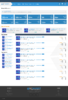
Three years ago we released the theme that we are still using today. Initially when we released it, seemingly a majority of our users hated it and wanted us to revert back, which I think is interesting because it was simply a modernisation and I figure that this time around something very likely is going to happen, especially because I want MC-Market to have our biggest design overhaul in history.

Over the past few months I have commissioned a handful of designers to make their rendition of what our resources index page could look like in a new XF2 theme designed by them, and here are the results:

This project was started last year by Kuchy to try and modernise the site further for XF2 while still maintaining a familiar style and layout to what we have today.
Resources - Light.png

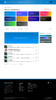
Mantas created a colourful and modern design that is a little bit less forum-like and traditional, which I think looks really great.
Screen Shot 2020-08-01 at 6.12.21 pm.png

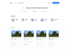
Zyrl took the idea of making the site look un-forum-ish and really ran with it with this design to create something minimalistic and modern. It's quite different to what our site currently looks like and would likely be a huge pain in the arse to actually develop, but I think that it's definitely a step in the right direction when it comes to having a new MC-Market XF2 theme made.
resource-3-2.png

None of the previous mockups has been completed and this thread isn't intended as a vote for which theme we should go with. Instead, I'm using these mockups I had created as a jumping-off point into having a discussion about what you'd like to see in our new theme. When planning for XF2 I had always envisioned that we would be able to make a design that doesn't simply look like a XenForo reskin and I'd really love to know which parts you really like from each of these mockups.

If anyone has any other websites you think could be used as inspiration for our redesign, or even wants to post your own mockup/ideas below then that would be amazing :)
 
Type
Suggestion
Status
Implemented

Attachments

  • Resources - Light.png
    Resources - Light.png
    727.7 KB · Views: 1,208
  • Screen Shot 2020-08-01 at 6.12.21 pm.png
    Screen Shot 2020-08-01 at 6.12.21 pm.png
    289.6 KB · Views: 1,206
  • resource-3-2.png
    resource-3-2.png
    218.3 KB · Views: 1,225
  • FireShot Capture 014 - MC-Market - www.mc-market.org.png
    FireShot Capture 014 - MC-Market - www.mc-market.org.png
    1.2 MB · Views: 1,178
Last edited:
PebbleHost
High performance, consistent uptime and fast support. Minecraft hosting that just works.

SamH_TM

Premium
Feedback score
1
Posts
11
Reactions
6
Resources
0
Definately Zyrl's approach to the design, however I think adding some contrast between the different sections would make the theme look alot cleaner, maybe alternating between MCM's Blue and White scheme. All have done a fantastic job regardless!
 

FlaringPhoenix

BlueFoxHost - discord.gg/bluefox
Supreme
Feedback score
3
Posts
128
Reactions
62
Resources
0
They all look amazing. Not sure how people are saying they hate them all... :cry:
 

Abdi

Graphic Designer and Motion Designer
Premium
Feedback score
11
Posts
70
Reactions
29
Resources
0
TBH, Zyrl's theme looks more like a hosting company's website front page
 

TBK

59,226.94 CRO
Deactivated
Feedback score
49
Posts
756
Reactions
753
Resources
0
Is it just me or do they all look shit.

I prefer the current theme.
 

Patrick

Supreme
Feedback score
16
Posts
674
Reactions
160
Resources
0
I like Kuchy's theme or Zyril's. I feel like it'll be between these two in the end.

Nonetheless, great work!
 

XER0GRAVITY

Editor
Supreme
Feedback score
13
Posts
366
Reactions
112
Resources
0
I like how Mantas took the original MC-M look and took it a step further, it's still relatively familiar but also modernizes the experience for both new and old users alike.

Zyrl did something similar, but look it 5x further when it comes to the modernization of the website. I really like how he took the original design and evolved it and think out-of-the-box with his mockup. Although I think that it's very pleasing to the eye, I dislike how it looks too different to the point where the site would feel unfamiliar to an older user.
 

Grace.

Supreme
Feedback score
19
Posts
796
Reactions
367
Resources
4
Simply aesthetic wise? Zyrl's

Realistically, they all make the forum look like less
of a community and more like a standard buy-sell goods platform which
there are hundreds of. Keep it looking more like a forum, less like a
market please.
 

Wezel

legend
Supreme
Feedback score
106
Posts
764
Reactions
431
Resources
0
I like all of them, but Mantis looks so clean doee, and the colors are appealing
 

Rsyx

sleep
Premium
Feedback score
20
Posts
234
Reactions
68
Resources
0
Zyril theme looks awesome, it's just that it has so many empty spaces around the theme. I'd suggest keeping some of the design aspects from the old one, I know that some people might say "go big or go home" but I don't think that's the case for UI/UX design.
 

emilyrose

emily
Restricted
Feedback score
0
Posts
9
Reactions
3
Resources
0
Zyrl's design looks great. I would definitely like to see that theme on MCM!
 

pol_vallverdu

Student + Developer and Content Creator
Supreme
Feedback score
8
Posts
102
Reactions
44
Resources
0
I love Kuchy's Theme
 

Nuckerr

Minecraft Developer
Premium
Feedback score
-1
Posts
62
Reactions
8
Resources
0
Sup gamers,

As MC-Market moves towards our XenForo 2 migration we're particularly excited about the potential for us to create a new theme to make the site look completely different. Five years ago we introduced our very first custom theme to the site which looks very similar to what the site still looks like today:


Three years ago we released the theme that we are still using today. Initially when we released it, seemingly a majority of our users hated it and wanted us to revert back, which I think is interesting because it was simply a modernisation and I figure that this time around something very likely is going to happen, especially because I want MC-Market to have our biggest design overhaul in history.

Over the past few months I have commissioned a handful of designers to make their rendition of what our resources index page could look like in a new XF2 theme designed by them, and here are the results:

This project was started last year by Kuchy to try and modernise the site further for XF2 while still maintaining a familiar style and layout to what we have today.View attachment 378922

Mantas created a colourful and modern design that is a little bit less forum-like and traditional, which I think looks really great.
View attachment 378923

Zyrl took the idea of making the site look un-forum-ish and really ran with it with this design to create something minimalistic and modern. It's quite different to what our site currently looks like and would likely be a huge pain in the arse to actually develop, but I think that it's definitely a step in the right direction when it comes to having a new MC-Market XF2 theme made.
View attachment 378924

None of the previous mockups has been completed and this thread isn't intended as a vote for which theme we should go with. Instead, I'm using these mockups I had created as a jumping-off point into having a discussion about what you'd like to see in our new theme. When planning for XF2 I had always envisioned that we would be able to make a design that doesn't simply look like a XenForo reskin and I'd really love to know which parts you really like from each of these mockups.

If anyone has any other websites you think could be used as inspiration for our redesign, or even wants to post your own mockup/ideas below then that would be amazing :)
Zyril's theme all the way
 

Zyr

Minexus Network (minexus.org)
Supreme
Feedback score
10
Posts
197
Reactions
111
Resources
0
+1 Kuchy, it still feels like MCM just reimagined

Zyrl's theme screams flaticon, it also feels like I'm browsing a schematic store (of which these kind of websites always gives off an "old, outdated and abandoned" vibe)
 

Coldfire

Entrepreneur
Ultimate
Feedback score
2
Posts
5
Reactions
110
Resources
12
Kuchy's because it's similar to the current style but more modern, Zyrl's isn't colorful enough and Mantas' is to colorful
 
Status
Top