Feedback/Appraisal on my friend's art.

Status
This thread has been locked.

Aekalix

Terraforming Connoisseur
Premium
Feedback score
46
Posts
1,725
Reactions
1,264
Resources
0
Hello!

Well, my friend loves drawing but her tablet pen broke.. She thinks she can do a lot better but drew this with her mouse.

Opinions on her art?
If you like it, what would you appraise it at and would you buy art from her (she wants a to buy a new pen)

AU8m3iX.jpg
 
PebbleHost
High performance, consistent uptime and fast support. Minecraft hosting that just works.

Kennedy

"Bloody Brilliant"
Supreme
Feedback score
75
Posts
672
Reactions
652
Resources
0
Ok.
For some reason I can't tell my own opinion.

Some parts I'm like, "Hey, that's cool!" and others I'm just like eh...

Otherwise it's not all too bad.
 

Aekalix

Terraforming Connoisseur
Premium
Feedback score
46
Posts
1,725
Reactions
1,264
Resources
0
Ok.
For some reason I can't tell my own opinion.

Some parts I'm like, "Hey, that's cool!" and others I'm just like eh...

Otherwise it's not all too bad.
Could you tell which is eh and what is cool?
 

Kennedy

"Bloody Brilliant"
Supreme
Feedback score
75
Posts
672
Reactions
652
Resources
0
Curvature of the earth, shadowing around the cave with circles, the bubbles around the ship :tup:

Trees, terrain, outlining, mountains :tdown:

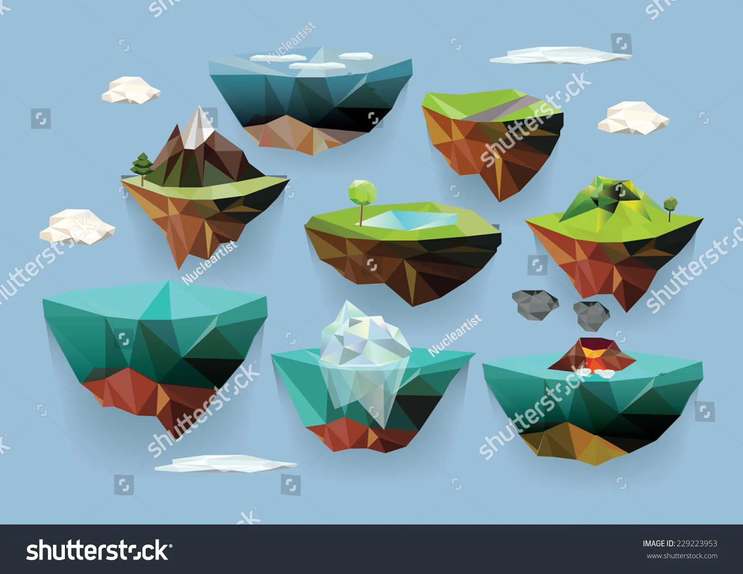
Otherwise I'd suggest you tell her to look into low-poly vector design. She's be much better at it than drawing.[DOUBLEPOST=1503388924][/DOUBLEPOST]
stock-vector-vector-low-poly-islands-set-for-your-design-229223953.jpg
 

Aekalix

Terraforming Connoisseur
Premium
Feedback score
46
Posts
1,725
Reactions
1,264
Resources
0
Curvature of the earth, shadowing around the cave with circles, the bubbles around the ship :tup:

Trees, terrain, outlining, mountains :tdown:

Otherwise I'd suggest you tell her to look into low-poly vector design. She's be much better at it than drawing.[DOUBLEPOST=1503388924][/DOUBLEPOST]
stock-vector-vector-low-poly-islands-set-for-your-design-229223953.jpg
I have seen some artwork of her (drawings) those are pretty good. I am still amazed what she can draw with just a mouse in a short time. Thanks for your opinion. I will forward it to her :D
 

Micheal

Harvard Dropout
Premium
Feedback score
1
Posts
36
Reactions
45
Resources
0
Looks pretty good for the style and especially since it was drawn with a mouse. A few things that I noticed that could be better is the outlining of the grass is shaded really weird, the island looks like its floating (correct me if its supposed to be floating), and the shape of the water in the background looks like it comes to some kind of apple shape instead of being a circle. Overall good art and looking at it as your pfp instead of close up is very forgiving of these flaws.
 

Resko

@re.sk
Premium
Feedback score
2
Posts
85
Reactions
29
Resources
0
The layering is quite off. Sure, it develops a style of some sort, but the way each layer has this pattern doesn't help the image merge. It is quite clunky in places, with with edges not well meeting the other edges. Overall outline could be improved a lot by trying to make it much more consistent. The airbrush clouds are decent, but again shading around the edges and adding highlights will define them much more. Moving on to the brushes, it would help by not using these weird fuzzy brushes, and to maybe move on to a different program that offers cleaner lines. (I recommend MediBang) Now for the colors, they are much too vibrant. It is important to find colors that are natural, maybe a bit more pastel to ease the strain off our eyes. In some places the shading is good but for example the entrance of the 'cave' could be greatly improved with a batter software and brush. For the text, try to go a little tiny bit thicker, and with less individual tilt, try to make straighter letters. Another thing to point out is the resolution. Again with a better program, high definition artworks can be made a lot easier, so I would try that.
Other than that, keep at the drawing, it gets easier with time, in a year's time with dedication you should be great at it.
Hope this helps.
 

Aekalix

Terraforming Connoisseur
Premium
Feedback score
46
Posts
1,725
Reactions
1,264
Resources
0
The layering is quite off. Sure, it develops a style of some sort, but the way each layer has this pattern doesn't help the image merge. It is quite clunky in places, with with edges not well meeting the other edges. Overall outline could be improved a lot by trying to make it much more consistent. The airbrush clouds are decent, but again shading around the edges and adding highlights will define them much more. Moving on to the brushes, it would help by not using these weird fuzzy brushes, and to maybe move on to a different program that offers cleaner lines. (I recommend MediBang) Now for the colors, they are much too vibrant. It is important to find colors that are natural, maybe a bit more pastel to ease the strain off our eyes. In some places the shading is good but for example the entrance of the 'cave' could be greatly improved with a batter software and brush. For the text, try to go a little tiny bit thicker, and with less individual tilt, try to make straighter letters. Another thing to point out is the resolution. Again with a better program, high definition artworks can be made a lot easier, so I would try that.
Other than that, keep at the drawing, it gets easier with time, in a year's time with dedication you should be great at it.
Hope this helps.
Thanks for the review, she asked if you could also critique this:
UDQdi6M.jpg
 

Resko

@re.sk
Premium
Feedback score
2
Posts
85
Reactions
29
Resources
0
Thanks for the review, she asked if you could also critique this:
UDQdi6M.jpg
Foreground is great. The little creature is well shaded with the grey in the bottom corner really giving depth paired with the slight drop shadow. The subtle pink is well done as well. If done with a tablet, just try to get your strokes a bit smoother, it can take up to like 10 tries for a line. For the mouth, maybe a little subtle highlight to make it a little shiny and maybe a little shadow under it to help make it blend in with the face. The shading of the ice under him is great, although you should work a little more on the light sources, adding some highlights again to show the reflectivity. Background should have sharper edges to show that it is in front of the creature. As well as this, take care to work with one source of light, this kind of defys the perspective and light techniques. Other than that it is great, keep it up, this is getting really good in quality.
 
Status
This thread has been locked.
Top