Navigation
-
-
Standalone Tebex Templates & themes Websites Pterodactyl Themes Addons Eggs NamelessMC Templates Modules XenForo Themes Addons Invision Community Themes Plugins Translations WHMCS Themes Modules Paymenter Themes Extensions Calagopus Themes Extensions Eggs LeaderOS themes Ghost themes Shopify themes Wix themes Squarespace themes Other webstores CraftingStore templates MineStore themes PayNow templates Other
-
-
-
Install the app
More options
You are using an out of date browser. It may not display this or other websites correctly.
You should upgrade or use an alternative browser.
You should upgrade or use an alternative browser.
Feedback on a logo design i made
- Thread starter PolarGFX
- Start date
- Status
- This thread has been locked.



PebbleHost
High performance, consistent uptime and fast support. Minecraft hosting that just works.


Looks good!
Here is some feedback. Hope it helps!

Here is some feedback. Hope it helps!
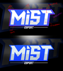
- There is a glitch in the outline on the top left > make sure the edges you have are consistent, if there is a single broken part your eye will kind of 'catch' on it.
- The blue outline is inconsistent. Again, consistency is key. Try to make sure any outline is consistent in offset.
- The mist white is pure white. Pure white and pure black are generally a no-no. Even just a touch of colour will help with visual depth.
- The grey on the text has 0 saturation. Grey is fine, but adding a touch of colour will help the logo feel more cohesive.
- The blue colour is completely flat. Use gradients to 'turn' planes in a direction. It's an extremely subtle touch that will add visual complexity.
Attachments

thx for the helpfull feedback will keep in mindLooks good!
Here is some feedback. Hope it helps!
Bottom image is with a few tweaks.
- There is a glitch in the outline on the top left > make sure the edges you have are consistent, if there is a single broken part your eye will kind of 'catch' on it.
- The blue outline is inconsistent. Again, consistency is key. Try to make sure any outline is consistent in offset.
- The mist white is pure white. Pure white and pure black are generally a no-no. Even just a touch of colour will help with visual depth.
- The grey on the text has 0 saturation. Grey is fine, but adding a touch of colour will help the logo feel more cohesive.
- The blue colour is completely flat. Use gradients to 'turn' planes in a direction. It's an extremely subtle touch that will add visual complexity.
View attachment 417003

- Status
- This thread has been locked.
