Banned forever. Reason: Rules violations
Navigation
-
-
Standalone Tebex Templates & themes Websites Pterodactyl Themes Addons Eggs NamelessMC Templates Modules XenForo Themes Addons Invision Community Themes Plugins Translations WHMCS Themes Modules Paymenter Themes Extensions Calagopus Themes Extensions Eggs LeaderOS themes Ghost themes Shopify themes Wix themes Squarespace themes Other webstores CraftingStore templates MineStore themes PayNow templates Other
-
-
-
Install the app
More options
You are using an out of date browser. It may not display this or other websites correctly.
You should upgrade or use an alternative browser.
You should upgrade or use an alternative browser.
Feedback on Design
- Thread starter openbrew
- Start date
- Status
- This thread has been locked.
PebbleHost
High performance, consistent uptime and fast support. Minecraft hosting that just works.
added one for delivered[DOUBLEPOST=1592857568][/DOUBLEPOST]
Thanks :>Decent not bad
Attachments

Banned forever. Reason: Rules violations
Thank you, what do you mean by language?Besides the language, they do what they're supposed to do. Nothing too fancy but in my opinion you don't need anything flashy anyway. Pretty good.
Banned forever. Reason: Rules violations

I'm pretty sure 'In processing' is just 'processing', no 'in'. You could go for 'Order processing'. Also personally I would change 'On the way' to something a tad more formal.Thank you, what do you mean by language?
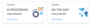
So i've been very bored and decided to re-do your design to demonstrate a few changes you can implement to potentially improve it.

You can instantly realise a rounder shape and a proper shadow will be the main factors of the design which make a bog difference. I also personally do not like having icons in designs coloured in a flat style, rather have one solid colour. Also, I'd suggest you keep a little spacing between elements, e.g. the icons from the edges. Essentially, centering all the content will help out a lot in getting out a better design.
Hope this helps, gl
So i've been very bored and decided to re-do your design to demonstrate a few changes you can implement to potentially improve it.
You can instantly realise a rounder shape and a proper shadow will be the main factors of the design which make a bog difference. I also personally do not like having icons in designs coloured in a flat style, rather have one solid colour. Also, I'd suggest you keep a little spacing between elements, e.g. the icons from the edges. Essentially, centering all the content will help out a lot in getting out a better design.
Hope this helps, gl
Looks really good, I will try my best to do it but I'm kinda trash at frontend stuff haha.
Banned forever. Reason: Rules violations
- Status
- This thread has been locked.