Navigation
-
-
Standalone Tebex Templates & themes Websites Pterodactyl Themes Addons Eggs NamelessMC Templates Modules XenForo Themes Addons Invision Community Themes Plugins Translations WHMCS Themes Modules Paymenter Themes Extensions Calagopus Themes Extensions Eggs LeaderOS themes Ghost themes Shopify themes Wix themes Squarespace themes Other webstores CraftingStore templates MineStore themes PayNow templates Other
-
-
-
Install the app
More options
You are using an out of date browser. It may not display this or other websites correctly.
You should upgrade or use an alternative browser.
You should upgrade or use an alternative browser.
Feedback on logo design
- Thread starter Masons Monarch
- Start date
- Status
- This thread has been locked.

PebbleHost
High performance, consistent uptime and fast support. Minecraft hosting that just works.

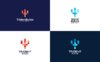
1 Is my fav but they're all good. In order from best to not best I would say 1, 4, 2, 3
1 Is my fav but they're all good. In order from best to not best I would say 1, 4, 2, 3
Thank you.

my version is better tbh https://gyazo.com/5df0d8e23fa99c0c6223f333edd1717d
my version is better tbh https://gyazo.com/5df0d8e23fa99c0c6223f333edd1717d
Bruh why are you putting such a masterpiece on my thread


Bottom left is by far the best in my book. This is partially because I feel that red and white is the greatest, most underrated color combination in the world, but it goes deeper than that. In logo design, you should strive to say something about your business with as minimal noise as possible (within reason). The gradients on the top don’t imply the discreetness you see in Minecraft blocks, but the solid color squares on the bottom do. Beyond that, the bottom right is blue and black, which is usually frowned upon. If you wanted to use that one, I’d make the blues a few shades darker each.
Source: learned basic logo design in a high school class in 2013
Source: learned basic logo design in a high school class in 2013
Bottom left is by far the best in my book. This is partially because I feel that red and white is the greatest, most underrated color combination in the world, but it goes deeper than that. In logo design, you should strive to say something about your business with as minimal noise as possible (within reason). The gradients on the top don’t imply the discreetness you see in Minecraft blocks, but the solid color squares on the bottom do. Beyond that, the bottom right is blue and black, which is usually frowned upon. If you wanted to use that one, I’d make the blues a few shades darker each.
Source: learned basic logo design in a high school class in 2013
Thank you for the helpful feedback. I am currently debating on which to use. I think I am definitely not going to use either of the blue ones but you make a good point about using the one that is clearly more minecraft oriented.
In my opinion 1 looks the best.
Thank you.

- Status
- This thread has been locked.