Navigation
-
-
Standalone Tebex Templates & themes Websites Pterodactyl Themes Addons Eggs NamelessMC Templates Modules XenForo Themes Addons Invision Community Themes Plugins Translations WHMCS Themes Modules Paymenter Themes Extensions Calagopus Themes Extensions Eggs LeaderOS themes Ghost themes Shopify themes Wix themes Squarespace themes Other webstores CraftingStore templates MineStore themes PayNow templates Other
-
-
-
Install the app
More options
You are using an out of date browser. It may not display this or other websites correctly.
You should upgrade or use an alternative browser.
You should upgrade or use an alternative browser.
FEEDBACK ON UI/UX DESIGN
- Thread starter FelixDev
- Start date
- Status
- This thread has been locked.

PebbleHost
High performance, consistent uptime and fast support. Minecraft hosting that just works.


Personally, I think it looks smashing.
Thanks man, I think it looks great as well just looking if anyone has some feedback on what I can do better,Personally, I think it looks smashing.
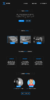
Personally, I think it looks very clean. It is very 2D like but still with overlapping layers on some parts to add some personality. It isn't boring to look at, actually it is very pleasing, it has personality and overall looks minimal and clean. Whoever made it, did a very good job.
Edit:
If there was anything that could/should be changed, it's staff member pictures. I think something that looks clean and professional (or just vector icons) would suit this design better.
Edit:
If there was anything that could/should be changed, it's staff member pictures. I think something that looks clean and professional (or just vector icons) would suit this design better.
Last edited:
Thanks for your honest opinion and feedback. I did this myself and I am actually really happy with it.Personally, I think it looks very clean. It is very 2D like but still with overlapping layers on some parts to add some personality. It isn't boring to look at, actually it is very pleasing, it has personality and overall looks minimal and clean. Whoever made it, did a very good job.
Edit:
If there was anything that could/should be changed, it's staff member pictures. I think something that looks clean and professional (or just vector icons) would suit this design better.
I am thinking of another way of the staff pictures but I will look into that more.
Thanks Toni!
Thanks man! I am thinking it looks good with them overlapping but maybe I should try something else, I will think about that but thanks for your feedbackI think it is absolutely gorgeous. Good job! The only thing that I think you can change, is that the titles are overlapping. Like the "Staff Team" and "Current Staff Team" are on top of each other. Other than that, it's amazing.

Thanks AdamW, Adding text to services is actually a great idea, But I am generally thinking about using some kind of hover effect on the live website to make it look even cleaner? Or is that not a good idea?Very clean design, could do with some more content on the page maybe some text under your services.
Other than that it looks amazing.
Thanks for your feedback
Hover effect would work, but text on the page would make it easier if someone just wanted to scroll down and read.Thanks AdamW, Adding text to services is actually a great idea, But I am generally thinking about using some kind of hover effect on the live website to make it look even cleaner? Or is that not a good idea?
Thanks for your feedback
In my opinion, I would include less spacing between the different items. Hope that helps!
I personally love it would suggest two things tho
1st : Would prefer changing the secondary text which is behind the headers ie. Staff Team, Features, etc.
2nd : Try matching the staff picture if you have cartoon / vectors make them both the same basically either add cartoons or IRL Pictures.
other than that its pretty gucci
1st : Would prefer changing the secondary text which is behind the headers ie. Staff Team, Features, etc.
2nd : Try matching the staff picture if you have cartoon / vectors make them both the same basically either add cartoons or IRL Pictures.
other than that its pretty gucci
- Status
- This thread has been locked.