Hot Summer Deals are Here!
Celebrate with up to 90% off on 16,800 resources
04
Days
04
Hours
52
Mins
29
Secs

Feedback on XF2 Theme Mockup

Mick

BuiltByBit Owner
Management
Feedback score
28
Posts
6,411
Reactions
7,662
Resources
0
Howdy folks,

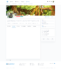
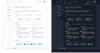
If you'll recall a few months ago we made a thread asking for feedback on preliminary mockups we had made by a few talented designers from our site. Since then we've gotten a lot of useful feedback and been able to make a revised mockup of how we think the site should look and feel when we migrate over.

As a reminder, when we migrate over from XF1 we'll need to remake the site completely from scratch, meaning redeveloping all of the addons and most notably the theme, giving us full flexibility. With the move, I'd like to take the opportunity to modernise and simplify. Here are some mockups of designs we're thinking of using.

resource-index.png
new-profile.png
ads-index-dark.png
your-ads.png

None of these designs are final and the point of this thread is to ask for feedback, so please let us know what you think (preferably in a constructive way)! No criticism is too big or small, but we'd just love as much feedback as possible. Thank you!
 
Type
Suggestion
Status
Implemented

Attachments

  • resource-index.png
    resource-index.png
    574.4 KB · Views: 1,358
  • new-profile.png
    new-profile.png
    791.3 KB · Views: 1,343
  • ads-index-dark.png
    ads-index-dark.png
    654.3 KB · Views: 1,346
  • your-ads.png
    your-ads.png
    162 KB · Views: 1,326
PebbleHost
High performance, consistent uptime and fast support. Minecraft hosting that just works.

Diz

⚔️ StellarDev ⚔️
Supreme
Feedback score
83
Posts
1,547
Reactions
1,656
Resources
34
Not loading for me nvm just slow

  • I think for the 'your resources' tab should be moved to third so the grouping makes more sense. Buyer tabs first then all your seller tabs second.
  • I don't like the placement of the section that says submit a resource. It seems odd where it is. Idk if on top or the bottom is better but something to look at maybe?
Looks very nice, the dark theme looks much sleeker than it does currently I love that look. I would love to see what the forums / threads are going to look like. Good looking stuff so far!
 
Last edited:

Function

Minecraft Plugin Developer
Supreme
Feedback score
38
Posts
938
Reactions
332
Resources
0
This is straight fire, and I agree with the other suggestions above this post.
 

xMarkus

MineStoreCMS Owner
Supreme
Feedback score
-1
Posts
1
Reactions
22
Resources
4
Looks very good.
In my opinion, it would be nice, if you rework icons and make them more 2D, not a 3D as they now on mockup.
And with such a view of featured resources, I think the price might be increased.
 

BreadBuilds

Rank 1 Build Shop 2024
Ultimate
Feedback score
6
Posts
106
Reactions
294
Resources
225
Really cool, good job! I have some insights.
• Some texts are too bright. Under certain circumstances, they can be overlooked.
upload_2021-6-8_19-6-0.png


• For resource index page I might appreciate top purchases or something similar.
• For featured resources's images I would think about 16:9 aspect ratio, it seems more acceptable.

Otherwise, I look forward to see all this coming ready and online! ;)
 

Attachments

  • upload_2021-6-8_19-6-0.png
    upload_2021-6-8_19-6-0.png
    3.3 KB · Views: 1,166

XER0GRAVITY

Editor
Supreme
Feedback score
13
Posts
366
Reactions
112
Resources
0
Personally, I'd like it if the blue was darker as it would be easier to read and stare at with the white background. Think something like what Discord has done with their recent rebrand. Discord's design team optimized the new design to work with both light mode and dark mode, which is ideal as it means that users don't feel as hard-pressed to choose one or another for legibility reasons.

I was almost going to say that the redesign almost looked too modern, but after thinking about it, I take that back. You almost need it to look as modern as possible if you want it to last a long time. I greatly respect the fact that Mick is taking his time with getting this migration done, as we need it more than ever. I don't want to see another design change for hopefully for another decade or longer. Yet by then, we'll likely see either a new version of XenForo or new software entirely made with a coding language that currently doesn't exist.
 

Polarbears

Supreme
Feedback score
2
Posts
596
Reactions
241
Resources
0
This looks really refreshing and a lot more reassuring, and it looks like it's something the site really needs since seeing it back in August. Is there any intentions with this new theme to implement more animation-like designs? Maybe like loading screens or other critical aspects of the website or will it have more of a static look.
 

tr1pped

Server Owner
Premium
Feedback score
0
Posts
106
Reactions
25
Resources
0
Way better, I'm impressed with the major improvements you have done to hopefully the next big step for MC-M. Looking forward to using the theme.
 

Inviss

Management / Head of Development @ AkumaMC
Supreme
Feedback score
21
Posts
734
Reactions
267
Resources
3
The theme looks super nice, and much more modern than the current one. I was expecting the migration to be a simple movement of files to an updated version and the same old MCM look, but a complete redesign is more than welcome in my eyes!
 

Gilles

UI/UX Designer
Supreme
Feedback score
19
Posts
80
Reactions
133
Resources
11
I absolutely love and appreciate the progress that was made on this topic. I'll try and provide constructive feedback in 2 ways, the visuals and the user experience, based on my own experience in the field. I noticed this thread was created about 2 months ago. I'm not sure to what point it is still relevant to this day, but hey I why not give it a try. As always, take everything I say with a grain of salt, nothing about it is to be taken personally.

Visuals
Apart from some contrast issues, the design is loving. I'm not sure who did the design part, but the person who did this definitely knows what he/she is doing. Consistent margins, drop shadows used the right way, overall great composition; it's all there. However I do have a few remarks.​

I would've loved to see a more vibrant blue going into the new redesign. This would look better in both light and dark theme, not to say we're trying to breathe new life into MCM. Just as Discord moved away from the muted purple, MCM could really benefit from a more upbeat color. I believe XER0GRAVITY mentioned this as well. There are some contrast issues here and there as well. They're an easy fix, so I won't complain about that too much.​

User Experience
I absolutely enjoy the way pages are composed; an obvious upgrade to the current layout. I have noted down food for thought.

I would rethink the subpages that go under each page. To me, they've always been very abstract and confusing. To give a simple example; what's the difference between the "Your Purchases" and "Your Licenses" page? Same for the current subpages in the Seller Dashboard. I often find myself going through each one to get what I'm looking for. Do you have data on the clickthrough rates? I would definitely consider going for a complete revamp of this part, if the data complements the claim I made. One idea would be to have one single Seller/Buyer dashboard displaying everything you need to know. In the end, less clicks is better UX. :)

Another interesting thought I had was about the way resources are displayed. While the mockup shows "Featured Resource", I would like to comment on the normal resource view. MCM is very versatile, people of all experience levels post resources and offer services. For this reason, people would need to be able to quickly separate the wheat from the chaff, in which showing the total purchases/downloads can be of great service. In fact, I think it may be the most important factor for a person to decide wether to click on the resource to view more. I won't say that's a good thing though. Keep in mind, this is just a hypothesis, would love to actually know wether resources with more purchases have higher view rates. I personally, have always been bothered by the lack of the purchase count on a resource page. On the other hand, a thumbnail might be a good replacement that will be a more reliable way to know the goodies.​

You're not giving away too much for us to critique other than pure visuals, which I completely understand of course. To really dive into this though, one should be working closer to the project, or get background information on the different choices that were made and why. Nonetheless, I hope that the things I pointed out were valuable.

I'm loving the progress and looking forward to see the end result!
 
Top