Navigation
-
-
Standalone Tebex Templates & themes Websites Pterodactyl Themes Addons Eggs NamelessMC Templates Modules XenForo Themes Addons Invision Community Themes Plugins Translations WHMCS Themes Modules Paymenter Themes Extensions Calagopus Themes Extensions Eggs LeaderOS themes Ghost themes Shopify themes Wix themes Squarespace themes Other webstores CraftingStore templates MineStore themes PayNow templates Other
-
-
-
Install the app
More options
You are using an out of date browser. It may not display this or other websites correctly.
You should upgrade or use an alternative browser.
You should upgrade or use an alternative browser.
First UI Dashboard
- Thread starter AdamW
- Start date
- Status
- This thread has been locked.

PebbleHost
High performance, consistent uptime and fast support. Minecraft hosting that just works.
What do you mean by "more interest"?Looks sleek, though the numbers should have more interest than what it is.
")
Thank youVery soothing to the eye to look at, keep at it
 [DOUBLEPOST=1561211588][/DOUBLEPOST]
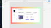
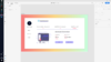
This is the completed version, if you have any tips/tricks on what I can do better or how to improve, please drop them below
Charnary Jeboh Updated opinions would be appreciated please!
Attachments
Last edited:
Are you designing the dashboard to practice, or are you designing it for someone?Adobe XD
I'm glad you said it's your first because it looks like crap. Everything is big and bold, colours are off and spacing is off. The only thing I can find that looks half decent is the gradient, which isn't even part of the design as far as I can tell.


You have too many colors going on at once. Stick with a 3-5 color palette. You have a good idea of going but it's too basic. Spice up the white background a bit. I'm not going to tell you specifically what but use your imagination. Get creative with it. Everyone loves some creativity.
Colors for palette
- Page Background
- Text Color
- Primary/Attention Color
- Secondary Color*
- Off-set color (this needs to be out there but also fitting with the other colors. Enough for the user to be interested but not confused)*
*: items can be omitted if you're going for less than 5 color palette.
use https://coolors.co/ if you can't figure out a palette for your own. Generate a couple and find a 5 set that interests you the most
Charnary said that the numbers need to be more of a priority than the text above it. I'd probably swap the two font sizes that way the numbers grab the viewer's attention more than the text.What do you mean by "more interest"?
(Samuel this is not directed at you. Just using your suggestion as proof of point)Everything is big and bold
Imagine me giving you a detailed list of stuff you should focus on in this format. Then I tell you to focus on the more important things.
You'll be confused about what's more important than the other suggestions. This is the problem with having everything bold. There is a time and place for bolding. Bolding is great for empowering content and grabbing that extra second of the viewer's attention but never should it be used on all the content.
For web designs, you want to give it your all. Dig down into your creative side and pull out some interesting things. Even if you can't code it, add it. Figure out how to code it later. Don't diminish your style over a small-term issue.
PracticeAre you designing the dashboard to practice, or are you designing it for someone?
Yeah, looks a bit meh now I look at it.Looks pretty clean and simple though I think you could add more and it wouldn't hurt the aestatic too much, keep it up! :tup:
It's the background and no need to be so harsh, I'm sure when you started out as a System Admin you were awful. I understand that dashboard looks bad, but I have recently created a proper UI for a company off my own back to get some practice.I'm glad you said it's your first because it looks like crap. Everything is big and bold, colours are off and spacing is off. The only thing I can find that looks half decent is the gradient, which isn't even part of the design as far as I can tell.
Practice
Great, practice. I think you're missing something HUGE and that's the fact that you need to get in the mindset of someone who would be interested in purchasing a design from you. What do they want, how do they want it, what purpose does it serve?
Judging from your design, you were kind of just thinking of, and throwing things in to fill up space.

No dashboard is really going to have a commissions accepted, satisfied customers, total earned, etc. nor is it really effective to have the account overview on the front like this. I'm not saying this is a result of a bad design, I'm saying you just have no clue what you're making and thus have no ideas for what to put on there resulting in some pretty arbitrary design choices.
First thing is first, just go ahead and take a look on... Google for some clean dashboard designs, and take note of what they do well and note the premise of the purpose they serve.
Here is one I found.

This here dashboard is probably something that would be used by a stock market investor. Now we think of the things a stock market investor would want to see, and put those things on the dashboard. Just off the top of my head, here's what we've got.
- Watchlist stock prices.
- Invested stock prices.
- Probably passing graphs?
- Information on selected stock prices.
- Search for other companies.
- Money tab which would include our profits within a certain timeframe, etc.
- Account overview.
- Sign out button.
Thank you, great advice and as I said it was my first one so wasn't to sure what to put on it. This should help me get betterGreat, practice. I think you're missing something HUGE and that's the fact that you need to get in the mindset of someone who would be interested in purchasing a design from you. What do they want, how do they want it, what purpose does it serve?
Judging from your design, you were kind of just thinking of, and throwing things in to fill up space.
No dashboard is really going to have a commissions accepted, satisfied customers, total earned, etc. nor is it really effective to have the account overview on the front like this. I'm not saying this is a result of a bad design, I'm saying you just have no clue what you're making and thus have no ideas for what to put on there resulting in some pretty arbitrary design choices.
First thing is first, just go ahead and take a look on... Google for some clean dashboard designs, and take note of what they do well and note the premise of the purpose they serve.
Here is one I found.
This here dashboard is probably something that would be used by a stock market investor. Now we think of the things a stock market investor would want to see, and put those things on the dashboard. Just off the top of my head, here's what we've got.
We think, what would go on the sidebar? What other uses could this application or website serve?
- Watchlist stock prices.
- Invested stock prices.
- Probably passing graphs?
- Information on selected stock prices.
- Search for other companies.
- Money tab which would include our profits within a certain timeframe, etc.
- Account overview.
- Sign out button.
Thank youI disagree with that guy completely, I've designed quite a few guis myself and I think this is really good, minus the gradient which I think is debatable. Otherwise, I like it a lot.[DOUBLEPOST=1561398830][/DOUBLEPOST]
Jesus take a chill pill man
It's OK, I wouldn't go as far as buying it.I'm glad you said it's your first because it looks like crap. Everything is big and bold, colours are off and spacing is off. The only thing I can find that looks half decent is the gradient, which isn't even part of the design as far as I can tell.
UI design is a very iterative process, which is why god invented Adobe XD for prototyping. There's a lack of consistency in the design, colour choice isn't great and it seems like you're going for a material design in some parts but flat in others.
Your layout is alright, I think you need to have consistent spacing between elements rather than just moving it about and calling it a day.
Just my two cents.
Sorry but there is no god and god certainly did not invent this kthnxIt's OK, I wouldn't go as far as buying it.
UI design is a very iterative process, which is why god invented Adobe XD for prototyping. There's a lack of consistency in the design, colour choice isn't great and it seems like you're going for a material design in some parts but flat in others.
Your layout is alright, I think you need to have consistent spacing between elements rather than just moving it about and calling it a day.
Just my two cents.
I'm god, take it back.Sorry but there is no god and god certainly did not invent this kthnx
Look at my profile picture, I am God.I'm god, take it back.
Welp I guess I got oofedLook at my profile picture, I am God.
- Status
- This thread has been locked.