So I'm gonna talk about the website as a whole cause that's what the OP is asking about and not some squabble about a username (it's not that hard to figure out who is who...).
I'm gonna have to disagree with people liking the site. In terms of simplicity, the site is perfect for that but diving into it more, it seems messy. It's like you couldn't pick a color palette so you threw different shades of pinks on the site. Usually you would keep the color palette to 5 at most. Those colors that are more on the red side I'd get rid of and replace with something else.
Contrast is also an issue as thelooter stated.

This section I'd go with a white background with the icons having the color of the navbar. Bold the section title and black text for that and the text paragraph. The button could also adapt the same color as the navbar with white text. Play with it and see what you like more. I don't like the card background color change on hover.
On mobile the html and body tags need to have overflow-x set to hidden due to the contents (probably the image) going off screen.
The navbar could use some fixing.

The drop-down has more bottom spacing than top so I'd add more top padding and remove some bottom padding.
I'm not sure how about the contact page. I guess it works? There's not enough content there to fill the page and the white-space.
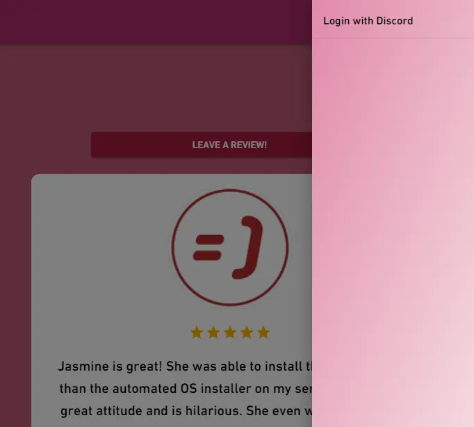
The reviews page could use some work. Arrows should be added to the carousel or have the carousel move on a fixed timer. The rating on the cards, I'm not sure why there's an effect added to stars to make it seem like viewers can change client's rating for you. It does nothing but the effect is there so I'd look into it and remove it. The font family is different from the main landing site so pick which font you want to use and stick with it. The navbar links are different as well, specifically at the effect, so again, pick a look and stick with it.
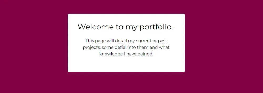
The portfolio page doesn't really feel like a portfolio page but more of background information on a specific project. Not really a design choice opinion but a personal one. In terms of the design, change the pink background to white and the text to black. The list icons will stick better and it would feel more fitting than having pink everywhere. The header needs to be changed around as well. The background color doesn't match well with the rest of the site and the text section is too basic. It seems like you took a bootstrap example code and just changed the text.
Overall, it's nice for something that works but from a design standpoint it's not great. It needs a refresh on the color palette and some pages just don't have enough content to require a dedicated page. Colors and contrast are the two big issues in my opinion so I hope my feedback helps. Best of luck
I'm gonna have to disagree with people liking the site. In terms of simplicity, the site is perfect for that but diving into it more, it seems messy. It's like you couldn't pick a color palette so you threw different shades of pinks on the site. Usually you would keep the color palette to 5 at most. Those colors that are more on the red side I'd get rid of and replace with something else.
Contrast is also an issue as thelooter stated.
This section I'd go with a white background with the icons having the color of the navbar. Bold the section title and black text for that and the text paragraph. The button could also adapt the same color as the navbar with white text. Play with it and see what you like more. I don't like the card background color change on hover.
On mobile the html and body tags need to have overflow-x set to hidden due to the contents (probably the image) going off screen.
The navbar could use some fixing.
The drop-down has more bottom spacing than top so I'd add more top padding and remove some bottom padding.
I'm not sure how about the contact page. I guess it works? There's not enough content there to fill the page and the white-space.
The reviews page could use some work. Arrows should be added to the carousel or have the carousel move on a fixed timer. The rating on the cards, I'm not sure why there's an effect added to stars to make it seem like viewers can change client's rating for you. It does nothing but the effect is there so I'd look into it and remove it. The font family is different from the main landing site so pick which font you want to use and stick with it. The navbar links are different as well, specifically at the effect, so again, pick a look and stick with it.
The portfolio page doesn't really feel like a portfolio page but more of background information on a specific project. Not really a design choice opinion but a personal one. In terms of the design, change the pink background to white and the text to black. The list icons will stick better and it would feel more fitting than having pink everywhere. The header needs to be changed around as well. The background color doesn't match well with the rest of the site and the text section is too basic. It seems like you took a bootstrap example code and just changed the text.
Overall, it's nice for something that works but from a design standpoint it's not great. It needs a refresh on the color palette and some pages just don't have enough content to require a dedicated page. Colors and contrast are the two big issues in my opinion so I hope my feedback helps. Best of luck