


I have wanted to do this for some time, but long story short I am just lazy :tup:. I will list all the bugs that I can find on the new theme below.
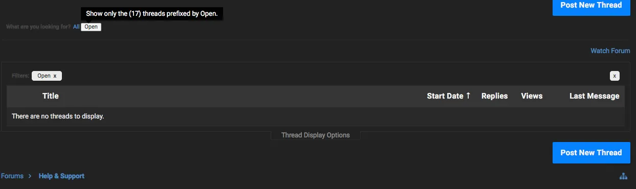
When you hover over [OPEN] in the support section, it shows all open support requests.
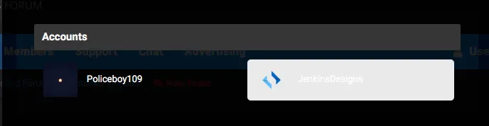
On the Dark Theme when you hover in the accounts section, it has white text.

You could change the Twitter Widget to the dark one on the dark theme.
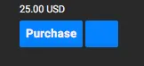
Upgrades Page: Blue box with no content
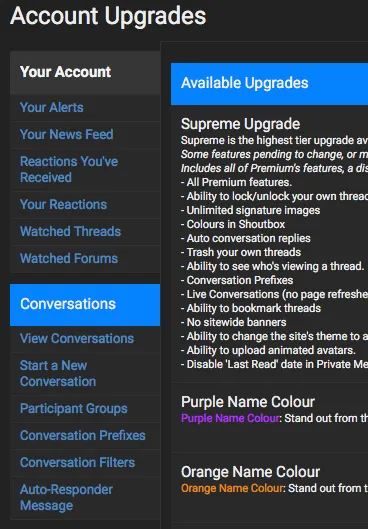
Your Account does not have a blue background like the rest.

The Settings and Options icon seems to be floating right too much.
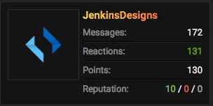
On the text side of this section, there needs to be more padding to the left of the text as it is pretty much touching the icon.
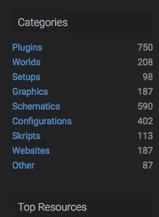
Some section titles do not have the blue background and white text.

The buttons on the MCMWIKI are not vertically centred.
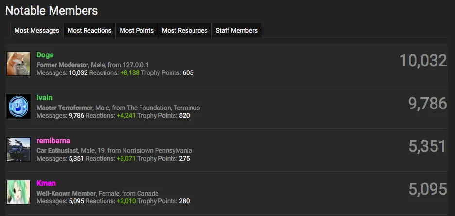
The profile icons and total number of messages are touching the sides.

The icons are not vertically centred on the navigation bar.

On the light theme, the chat section has a dark header, while other sections have a light header.
When you hover over [OPEN] in the support section, it shows all open support requests.
On the Dark Theme when you hover in the accounts section, it has white text.
You could change the Twitter Widget to the dark one on the dark theme.
Upgrades Page: Blue box with no content
Your Account does not have a blue background like the rest.
The Settings and Options icon seems to be floating right too much.
On the text side of this section, there needs to be more padding to the left of the text as it is pretty much touching the icon.
Some section titles do not have the blue background and white text.
The buttons on the MCMWIKI are not vertically centred.
The profile icons and total number of messages are touching the sides.
The icons are not vertically centred on the navigation bar.
On the light theme, the chat section has a dark header, while other sections have a light header.
- Status
- Accepted
Banned forever. Reason: Scamming (https://builtbybit.com/threads/ben-v-joogie-transaction-dispute.726256)



