Mc-Market New Branding/Theme

Status

y0jJJyeDYzRTYomFX

Deactivated
Feedback score
16
Posts
209
Reactions
616
Resources
0
Thank you for all your support towards this project. The extension is released, here's an official statement from Mick:

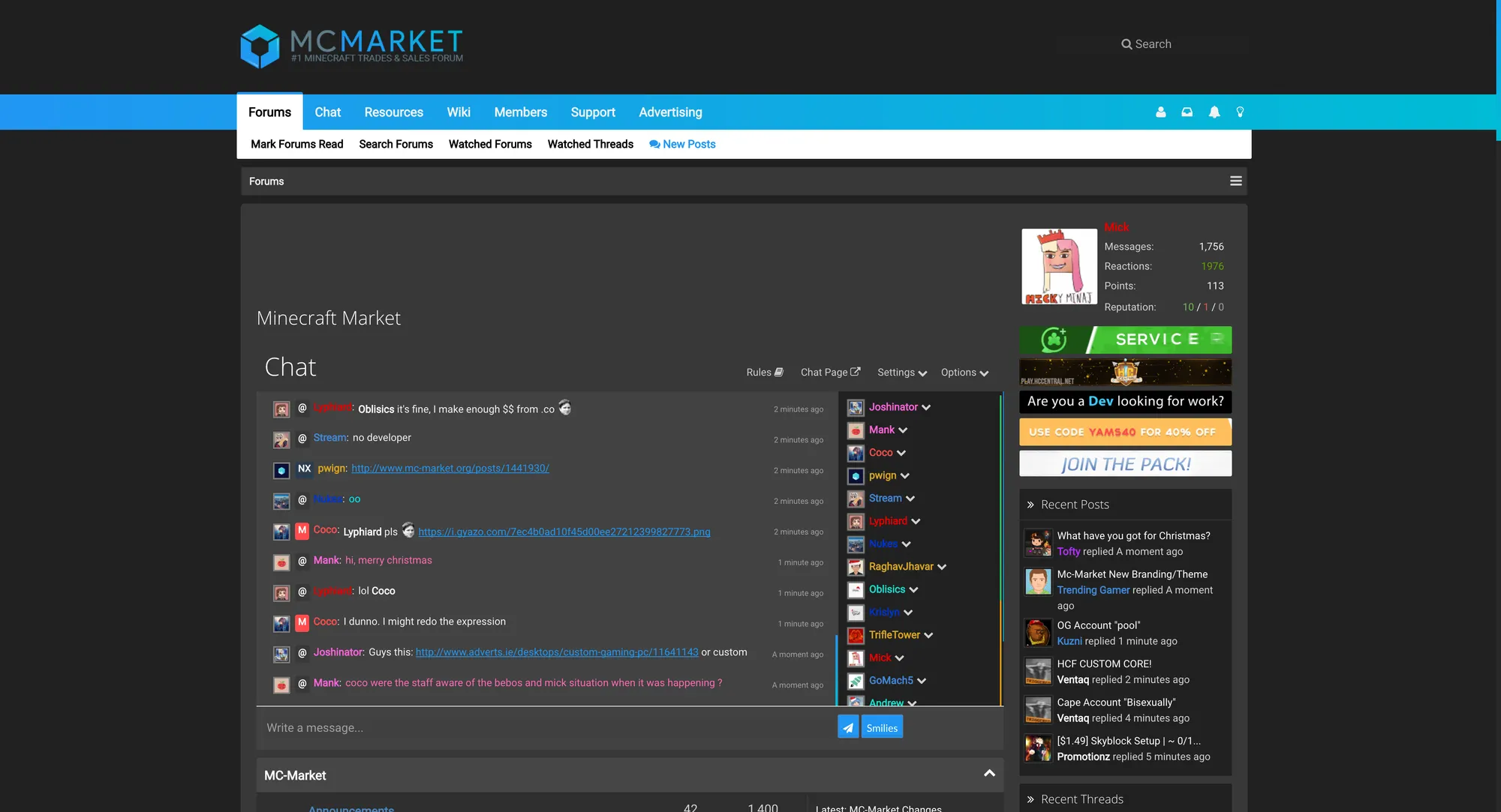
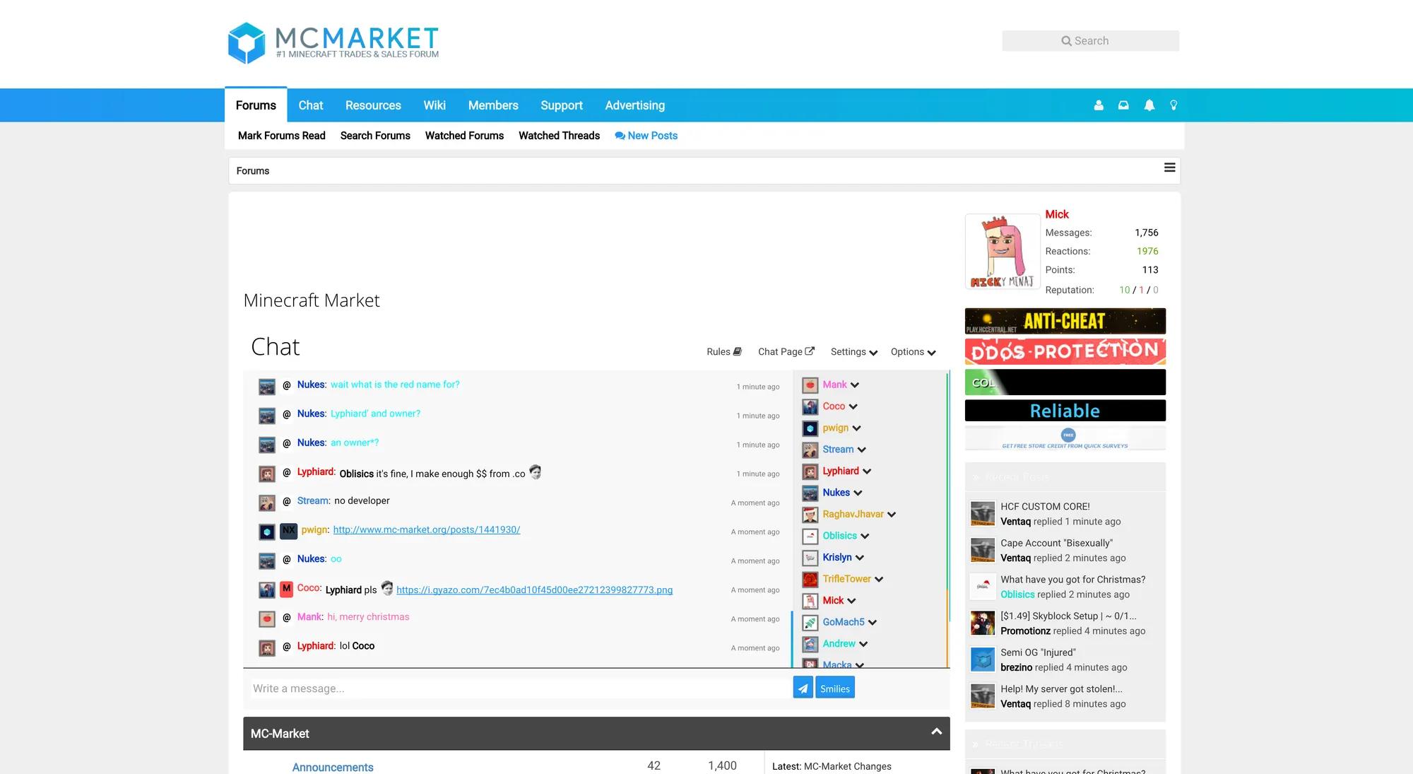
Over the past few months, a suggestion made by y0jJJyeDYzRTYomFX has been gaining more and more popularity, to the point where it's now the most viewed suggestion ever made in the history of MC-Market. Today I'm very proud to announce that a Chrome Browser extension has been developed by y0jJJyeDYzRTYomFX, Wvisoecj, and Ajdin. The extension allows for you to select a very sleek and modern theme for MC-Market, which wouldn't be possible to add as a regular theme with the restrictions that xenForo has.

This extension has been planned and created over several months with many beta testers. The beta testers were: TechBanana, lAkjtzAZ0, Arcrimonia, rexs123, y0jJJyeDYzRTYomFX, Wvisoecj, myself, 1amDev, mattrick, Elcro, Chearful, TheLightDev, Candy, @NikDev, and Hoot. Without these beautiful people, the addon wouldn't be as bug-free as it is. Right now, there is currently one theme that you can switch to, but in the future, it's planned to add much more.

To get the extension, you must be using the Chrome Browser and you can download Onyx here: https://onyx.pwign.com/, and once again thank you to y0jJJyeDYzRTYomFX and Wvisoecj for their work on creating this for the community.

A screenshot of what the theme looks like right now can be seen below.
937b8f3df361e8f736da7918a840cc3c.png
f9e7b67dcf2fae23e0870653a16b87a0.png

Thank you.
BcsL.png

usgb.png
 
Type
Suggestion
Status
Implemented
Last edited:
PebbleHost
High performance, consistent uptime and fast support. Minecraft hosting that just works.

y0jJJyeDYzRTYomFX

Deactivated
Feedback score
16
Posts
209
Reactions
616
Resources
0
That's so awesome
Thank you.


This looks amazing! The admins should look into this!
Thanks for the support.


After seeing this, the current design looks like its 10 years old.
Kappa


#pwignforwebdeveloper Kappa I absolutely love this, i really really hope this gets considered by bebo and his team :3 <3
Haha, I wouldn't claim myself as a web developer since all I did was designing the concept inside Illustrator, but thanks for the support <3
 

PandaPlaysAll

|Survival Server in Construction|
Premium
Feedback score
22
Posts
660
Reactions
252
Resources
0
So simple but good. Now thinking about it, it makes the current website look garbage. BUT i somewhat feel like im using a Macbook through your style
 

Tofty

Retired Staff
Supreme
Feedback score
24
Posts
1,555
Reactions
869
Resources
0
I really like everything except the Icons.
The current icons are fine and the ones you suggest don't fit, nor do they have a meaning here.
 

y0jJJyeDYzRTYomFX

Deactivated
Feedback score
16
Posts
209
Reactions
616
Resources
0
So simple but good. Now thinking about it, it makes the current website look garbage. BUT i somewhat feel like im using a Macbook through your style
Fun fact: I've never used a mac nor its OS before. And thanks for the compliment.


I really like everything except the Icons.
The current icons are fine and the ones you suggest don't fit, nor do they have a meaning here.
Thank you, I do appreciate your feedbacks. One of the thing that I don't like about the current design is the consistency in icons and its accessibility.

tB4GS.png

The current down chevron is personally too bold comparing to other icons in the line. The space between the gaps of the mailbox is too small. The Alert icon is not related to its functionality and it's too thin. And lastly, the light bulb icon for Styles is not as bold as other icons in the same line. I'm not saying that the icons are bad, my point here is that those icons do not work well together. I've personally wanted to design my own icons in the first place, but the time assumption and my skills are not enough so I've decided to use Google open-sourced instead.


Amazing !:D
Thank you.
 

Overlord

Supreme
Feedback score
2
Posts
569
Reactions
276
Resources
0
Good fucking job with that. It's a very minimalistic style suitable for a site like this. Unfortunately, styles in XenForo right now are much harder than you think. This would be more suitable for when the site inevitably moves over to XenForo 2.x with a better templating system, amongst other improvements.

This would be a huge benefit to MC-Market. I'm sure BeBosny would love to collaborate with you, hire you or use your ideas and hire a designer to make the concept come true. It's a very good idea for this place.

Nice idea and good effort on a suggestion, for once. Jesus, is this the first time I've left a positive comment on a suggestion...
 

Shattered

old-timer
Supreme
Feedback score
5
Posts
3,486
Reactions
2,059
Resources
0
Not sure how I feel about 'rebranding'.

Your colors look very nice, (as a dark theme), I am used to the light theme.
The only things that don't really look appealing to me are the extra use of icons, and the added roundness.
 

exhale

Thriving Editor.
Premium
Feedback score
2
Posts
2,002
Reactions
838
Resources
0

Mtizer

Follow me on twitter @Mtizerr
Premium
Feedback score
0
Posts
155
Reactions
69
Resources
0
I love the logo and the text front but I don't think we need a chat box that big.
 

Isaac

grphcrtv.com
Supreme
Feedback score
3
Posts
270
Reactions
290
Resources
0
YES!

Been wanting to do something similar myself but haven't had the time. Pwign, this looks amazing. Hope it gets considered :)
 

nick

Supreme
Feedback score
24
Posts
435
Reactions
386
Resources
0
This looks so modern and clean, Really hope they consider making this a official theme that members can pick
 

Mitchell

Deactivated
Feedback score
8
Posts
459
Reactions
341
Resources
0
A modern design would be especially refreshing while browsing Mc-Market, however I would definitely love to have something kept from the current design. That way MC-Market can keep aspects that have been around with all the drama and growth Kappa
 
Status
Top