Navigation
-
-
Standalone Tebex Templates & themes Websites Pterodactyl Themes Addons Eggs NamelessMC Templates Modules XenForo Themes Addons Invision Community Themes Plugins Translations WHMCS Themes Modules Paymenter Themes Extensions Calagopus Themes Extensions Eggs LeaderOS themes Ghost themes Shopify themes Wix themes Squarespace themes Other webstores CraftingStore templates MineStore themes PayNow templates Other
-
-
-
Install the app
More options
You are using an out of date browser. It may not display this or other websites correctly.
You should upgrade or use an alternative browser.
You should upgrade or use an alternative browser.
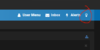
Move theme switch to user menu.
- Thread starter hgbf
- Start date
- Status

PebbleHost
High performance, consistent uptime and fast support. Minecraft hosting that just works.


I find myself often forgetting that the button even exists. Haven't ever overshot it so much to have actually clicked it unintentionally, so I'm afraid I can't empathize with your plight. However, when you draw attention to it like that, it is unsightly. Honestly, if someone picks a theme to use, they're probably not going to be changing it every other day, and I'd prefer the nav bar be reserved for things whose convenience is warranted, such as alerts and private messages, obviously.
Putting it in the usermenu is probably also unnecessary.
Giving it a place in https://www.mc-market.org/account/preferences is probably the best idea.
Unfortunately for you, removing the lightbulb won't increase the size of the Alerts bar, thus making it easier to click, so for you I'd recommend simply CTRL +ing your browser.


I disagree.I find myself often forgetting that the button even exists. Haven't ever overshot it so much to have actually clicked it unintentionally, so I'm afraid I can't empathize with your plight. However, when you draw attention to it like that, it is unsightly. Honestly, if someone picks a theme to use, they're probably not going to be changing it every other day, and I'd prefer the nav bar be reserved for things whose convenience is warranted, such as alerts and private messages, obviously.
Putting it in the usermenu is probably also unnecessary.
Giving it a place in https://www.mc-market.org/account/preferences is probably the best idea.
Unfortunately for you, removing the lightbulb won't increase the size of the Alerts bar, thus making it easier to click, so for you I'd recommend simply CTRL +ing your browser.
I don't think that the theme switcher functionality in the nav bar there is unsightly or inconvenient. Switching themes being really easy isn't a problem I don't think, and even if you accidentally misclick it once you can just click it again to switch back instantly.
Denied, thanks for the suggestion.
- Status