MX Luxe Template feedback

Status
This thread has been locked.

Paper Cars

Audio Production Services
Supreme
Feedback score
8
Posts
514
Reactions
103
Resources
0
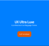
Working on my design skills, I designed this website. Looking for thoughts so that I can grow in my ability to design websites as well as create them.

Website: https://www.ethanski.xyz/mxluxe

**Note using CSS Variables I've made every color customizable.

Let me know your thoughts and opinions!

Thanks, Ethan.
 
PebbleHost
High performance, consistent uptime and fast support. Minecraft hosting that just works.

Kuchy

Web Developing Cake
Support
Feedback score
14
Posts
664
Reactions
505
Resources
2
It's got quite a few problems (some being opinions and others being common practice) so I'm going to list them out here.

The palette: I don't like the orange and blue color scheme, especially when you put one on top of the other. It hurts my eyes.

Capture+_2021-04-19-12-26-58.png

The header: Although it's good in terms of layout, it's got a bit more whitespace than needed. Maybe increase the font size on the main header, add a little bit of margin between the main header and sub header and maybe a secondary button next to the call to action.

Capture+_2021-04-19-12-26-31.png

The stats bar: Not all of the buttons are 100% round (use border-radius: 100%) and they aren't the same size either. Pick a size that would fit a large number and force the width and height for it. The background-color is also a poor choice. Granted, it can do just fine without any of the styling. Just leave the text as is and make the font-size bigger and bold it. If you want to keep the circle background, do the changes suggested at the beginning of this section.

Capture+_2021-04-19-12-27-16.png

Features Section: I think the box-shadow is a bit harsh. Maybe lower the opacity on it a bit. Blue on orange is a no no (another hurts my eyes). The hover effect on those cards are weird. Maybe just do a light transform animation instead of a border animation or whatever it is. Maybe look at some other sites and see how they set up their feature section. A lot of them, such as hosting companies, keep it simple and straight to the point.

Capture+_2021-04-19-12-27-46.png

Features Card: Maybe set the paragraph opacity to 70% and increase the margin between the feature card heading and the paragraph.

Portfolio: The heading shouldn't be bigger than your main heading text (mentioned at the beginning of the post)

Capture+_2021-04-19-12-28-15.png

Contact form: It's not in a container so it feels off from the rest of the site. Put it in a container and should be fine after that. Seems to be a mobile issue only as it's wrapped in the container for desktop.

The Navigation: The font-size and nav links are too big. Just keep it simple and put it to the right of the bar. Also, I can trigger the nav link hover effect without even hovering over the text so your padding for the links are way too big.

The Buttons: The border-radius on call to action is a bit much. Maybe do 8px for that and 8px for the submit button on the contact form. Make the buttons the same size too.

Results from contrast checker (using Open CC Checker Chrome extension):
upload_2021-4-19_13-3-6.png

upload_2021-4-19_13-3-41.png
 

Attachments

  • Capture+_2021-04-19-12-26-58.png
    Capture+_2021-04-19-12-26-58.png
    23.9 KB · Views: 40
  • Capture+_2021-04-19-12-26-31.png
    Capture+_2021-04-19-12-26-31.png
    21.3 KB · Views: 37
  • Capture+_2021-04-19-12-28-15.png
    Capture+_2021-04-19-12-28-15.png
    768.4 KB · Views: 35
  • Capture+_2021-04-19-12-27-46.png
    Capture+_2021-04-19-12-27-46.png
    95.8 KB · Views: 41
  • Capture+_2021-04-19-12-27-16.png
    Capture+_2021-04-19-12-27-16.png
    245.4 KB · Views: 38
  • upload_2021-4-19_13-3-6.png
    upload_2021-4-19_13-3-6.png
    36.9 KB · Views: 36
  • upload_2021-4-19_13-3-41.png
    upload_2021-4-19_13-3-41.png
    35.4 KB · Views: 39

Paper Cars

Audio Production Services
Supreme
Feedback score
8
Posts
514
Reactions
103
Resources
0
It's got quite a few problems (some being opinions and others being common practice) so I'm going to list them out here.

The palette: I don't like the orange and blue color scheme, especially when you put one on top of the other. It hurts my eyes.

View attachment 439488
The header: Although it's good in terms of layout, it's got a bit more whitespace than needed. Maybe increase the font size on the main header, add a little bit of margin between the main header and sub header and maybe a secondary button next to the call to action.

View attachment 439489
The stats bar: Not all of the buttons are 100% round (use border-radius: 100%) and they aren't the same size either. Pick a size that would fit a large number and force the width and height for it. The background-color is also a poor choice. Granted, it can do just fine without any of the styling. Just leave the text as is and make the font-size bigger and bold it. If you want to keep the circle background, do the changes suggested at the beginning of this section.

View attachment 439492
Features Section: I think the box-shadow is a bit harsh. Maybe lower the opacity on it a bit. Blue on orange is a no no (another hurts my eyes). The hover effect on those cards are weird. Maybe just do a light transform animation instead of a border animation or whatever it is. Maybe look at some other sites and see how they set up their feature section. A lot of them, such as hosting companies, keep it simple and straight to the point.

View attachment 439491
Features Card: Maybe set the paragraph opacity to 70% and increase the margin between the feature card heading and the paragraph.

Portfolio: The heading shouldn't be bigger than your main heading text (mentioned at the beginning of the post)

View attachment 439490
Contact form: It's not in a container so it feels off from the rest of the site. Put it in a container and should be fine after that. Seems to be a mobile issue only as it's wrapped in the container for desktop.

The Navigation: The font-size and nav links are too big. Just keep it simple and put it to the right of the bar. Also, I can trigger the nav link hover effect without even hovering over the text so your padding for the links are way too big.

The Buttons: The border-radius on call to action is a bit much. Maybe do 8px for that and 8px for the submit button on the contact form. Make the buttons the same size too.

Results from contrast checker (using Open CC Checker Chrome extension):
View attachment 439501
View attachment 439503

Amazing stuff from Kuchy as I would expect. Really appreciate the feedback! I've always done mockup -> html/css/js and I've really never gotten into the design aspect of this industry and I really need to. I'll take all of this into consideration. Appreciate it!
 
Status
This thread has been locked.
Top