Navigation
-
-
Standalone Tebex Templates & themes Websites Pterodactyl Themes Addons Eggs NamelessMC Templates Modules XenForo Themes Addons Invision Community Themes Plugins Translations WHMCS Themes Modules Paymenter Themes Extensions Calagopus Themes Extensions Eggs LeaderOS themes Ghost themes Shopify themes Wix themes Squarespace themes Other webstores CraftingStore templates MineStore themes PayNow templates Other
-
-
-
Install the app
More options
You are using an out of date browser. It may not display this or other websites correctly.
You should upgrade or use an alternative browser.
You should upgrade or use an alternative browser.
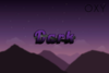
Opinion on this logo!
- Thread starter oxycottyn
- Start date
- Status
- This thread has been locked.
PebbleHost
High performance, consistent uptime and fast support. Minecraft hosting that just works.
Looks pretty good, you also got the colours, saturation and contrast right. But one thing i would say is the line in the word ‘Dark’ is not very smooth.
Yeah I'm still working on those lines. I'm saving up for a drawing tablet which will make tasks like these in the future really easy.Looks pretty good, you also got the colours, saturation and contrast right. But one thing i would say is the line in the word ‘Dark’ is not very smooth.
Oxycotton if u also wanna make a night background use the gradient tool( (FG TO BG - Linear) and just set ur FG to the bottom colour (dark blue) and the BG to the top colour(black) then just drag ur mouse up on the canvas, this will make a very smooth and satisfying background.
- Status
- This thread has been locked.