Navigation
-
-
Standalone Tebex Templates & themes Websites Pterodactyl Themes Addons Eggs NamelessMC Templates Modules XenForo Themes Addons Invision Community Themes Plugins Translations WHMCS Themes Modules Paymenter Themes Extensions Calagopus Themes Extensions Eggs LeaderOS themes Ghost themes Shopify themes Wix themes Squarespace themes Other webstores CraftingStore templates MineStore themes PayNow templates Other
-
-
-
Install the app
More options
You are using an out of date browser. It may not display this or other websites correctly.
You should upgrade or use an alternative browser.
You should upgrade or use an alternative browser.
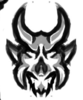
[OPINIONS] New Fortnite Ragnarok Mascot Logo
- Thread starter FileLost
- Start date
- Status
- This thread has been locked.



PebbleHost
High performance, consistent uptime and fast support. Minecraft hosting that just works.


Cheers!Looks great!


Blur is to make sure others don't claim itAwesome design, not a fan of the blur but still a great style and technique


Very cool! Good luck!

Right, my badBlur is to make sure others don't claim it


Okay, it's a mascot so obviously it's not going to be a replica. I believe it shows the basic shapes of RagnarokIt looks great, but nothing like ragnorak

View attachment 165458
Made this in 20 minutes. Original sketch limited myself to five, cleaned it up in illustrator. Original sketch below.
View attachment 165460
First thoughts:
It looks really good. The horns are my favourite part, i love the shading for that part, and it just looks very sharp and clean. It also fits the ragnarok sort of part. The ears are quite nice too, but i feel like they are a bit too defined, and they stick out way more than the actual face and facial features. Very good mascots are always the ones where the emphasis is on facial expression, and then the horns.
The facial features:
The eyes kind of confuse me, because they don't look like the ragnarok's eyes nor do i feel like it's better than the ragnarok's eyes. I think if you made the eyes looks more fierce and angry the mascot would look better. The nose is alright, but I just feel like the shaping is a bit off.
The shading is quite nice, I feel like the colour choices could have been a bit better. Your overall shape is very good, and that's the first step. You should try and improve your facial features, your horns are very good, and yeah that's pretty much it. Your mascot is really good, but try and make the facial part a bit more emphasized.
First thoughts:
It looks really good. The horns are my favourite part, i love the shading for that part, and it just looks very sharp and clean. It also fits the ragnarok sort of part. The ears are quite nice too, but i feel like they are a bit too defined, and they stick out way more than the actual face and facial features. Very good mascots are always the ones where the emphasis is on facial expression, and then the horns.
The facial features:
The eyes kind of confuse me, because they don't look like the ragnarok's eyes nor do i feel like it's better than the ragnarok's eyes. I think if you made the eyes looks more fierce and angry the mascot would look better. The nose is alright, but I just feel like the shaping is a bit off.
The shading is quite nice, I feel like the colour choices could have been a bit better. Your overall shape is very good, and that's the first step. You should try and improve your facial features, your horns are very good, and yeah that's pretty much it. Your mascot is really good, but try and make the facial part a bit more emphasized.
Thanks for the feedback. Please comprehend that I spent 20 minutes in total on this 5 minute sketch and 15 minutes vector. There are no ears they're the secondary horns ragnarok has. The eyes look fine. Still looks menacing in my opinion. If you're going to do a mascot it's not going to be an exact replica, it shows the basic shape that ragnarok has.
You asked for opinions, and I gave you opinions. If you aren't going to take anything into account from these opinions, don't make this thread please. If it took 20 minutes, don't ask for opinions from it as it doesn't show you your true skill. You'll probably just hear stuff you already know about. In other words, just don't bother making this thread if you aren't going to benefit from it at all or take anything into account.Thanks for the feedback. Please comprehend that I spent 20 minutes in total on this 5 minute sketch and 15 minutes vector. There are no ears they're the secondary horns ragnarok has. The eyes look fine. Still looks menacing in my opinion. If you're going to do a mascot it's not going to be an exact replica, it shows the basic shape that ragnarok has.


There's no reason to keep on posting these just to boost your ego if you can't even take some constructive criticism.Thanks for the feedback. Please comprehend that I spent 20 minutes in total on this 5 minute sketch and 15 minutes vector. There are no ears they're the secondary horns ragnarok has. The eyes look fine. Still looks menacing in my opinion. If you're going to do a mascot it's not going to be an exact replica, it shows the basic shape that ragnarok has.
I'm trying to speed my flow of work so I wanted to know how it looked for a 20 minute project.[DOUBLEPOST=1542887731][/DOUBLEPOST]Why did you only spend 20 minutes? but yet ask for opinions.
Okay.There's no reason to keep on posting these just to boost your ego if you can't even take some constructive criticism.
Last edited:
- Status
- This thread has been locked.
