
Navigation
-
-
Standalone Tebex Templates & themes Websites Pterodactyl Themes Addons Eggs NamelessMC Templates Modules XenForo Themes Addons Invision Community Themes Plugins Translations WHMCS Themes Modules Paymenter Themes Extensions Calagopus Themes Extensions Eggs LeaderOS themes Ghost themes Shopify themes Wix themes Squarespace themes Other webstores CraftingStore templates MineStore themes PayNow templates Other
-
-
-
Install the app
More options
You are using an out of date browser. It may not display this or other websites correctly.
You should upgrade or use an alternative browser.
You should upgrade or use an alternative browser.
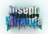
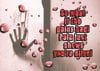
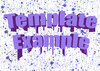
Opinions on images I've created.
- Thread starter ImageText Designs
- Start date
- Status
- This thread has been locked.


PebbleHost
High performance, consistent uptime and fast support. Minecraft hosting that just works.


I am no graphics designer, but here are some tips I think would help:
1. Focus more on 2D text, it seems to be more in style nowadays.
2. Look for better fonts, there are tons out there for free.
3. Sometimes it is possible to have TOO much on a design, try to create stuff that is simple/clean.
4. Have text and a background that contrast each other. This makes your text stand out.
5. Refrain from adding large strokes/outlines to your text.
6. Refrain from adding crazy looking textures to your text.
7. Try to keep a color scheme throughout your design. 3-4 different colors maximum is probably best.
Other than that, looks good. Practice makes perfect. :tup:
1. Focus more on 2D text, it seems to be more in style nowadays.
2. Look for better fonts, there are tons out there for free.
3. Sometimes it is possible to have TOO much on a design, try to create stuff that is simple/clean.
4. Have text and a background that contrast each other. This makes your text stand out.
5. Refrain from adding large strokes/outlines to your text.
6. Refrain from adding crazy looking textures to your text.
7. Try to keep a color scheme throughout your design. 3-4 different colors maximum is probably best.
Other than that, looks good. Practice makes perfect. :tup:
Last edited:
- Status
- This thread has been locked.
