
I have just recently started doing GFX, can I have some opinions on my banner
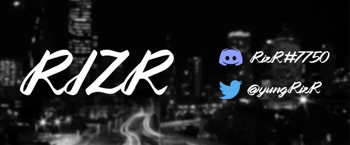

Same model as on every banner ever, but col with the city instead of some random colour fade
The main thing about gfx is you gotta make it look unique and hard to mimic. Given the font, I can make the exact same thing in paint so it feels a lot less special to me and other people
Thanks for the feedback everyone! I'm gonna try make my designs more unique to others and try using different effects!The drop shadow is good as it distinguishes from the background and makes it bold. The city background is good, I highly recommend bright and contrast to bring those colours out. Only problem is that it's the same as everyone else's.
Where did I say this was a minecraft banner?If this is a Minecraft banner: I really don’t understand why the background is a city?

You're on a Minecraft Store website.Where did I say this was a minecraft banner?

