Navigation
-
-
Standalone Tebex Templates & themes Websites Pterodactyl Themes Addons Eggs NamelessMC Templates Modules XenForo Themes Addons Invision Community Themes Plugins Translations WHMCS Themes Modules Paymenter Themes Extensions Calagopus Themes Extensions Eggs LeaderOS themes Ghost themes Shopify themes Wix themes Squarespace themes Other webstores CraftingStore templates MineStore themes PayNow templates Other
-
-
-
Install the app
More options
You are using an out of date browser. It may not display this or other websites correctly.
You should upgrade or use an alternative browser.
You should upgrade or use an alternative browser.
Opinions on my threat design
- Thread starter SeaPvP
- Start date
- Status
- This thread has been locked.


PebbleHost
High performance, consistent uptime and fast support. Minecraft hosting that just works.

?[DOUBLEPOST=1515765153][/DOUBLEPOST]It's a thread, might want to change that too.
ThanksIt is average, Fonts can be moved, better fonts can be used. The plain ugly color makes it look well shit.Spice up the color mate! And for the image above (the top) use a transparent one.
You wrote threat and it has to be thread.

Threat =/= Thread.
The design is quite frankly put very bad. It needs to be fixed up a whole lot before it could even be presentable as free;

- Tristan M.[DOUBLEPOST=1515772993][/DOUBLEPOST]To give my criticism a firm footing I've made a new version of this (Pretty much the same.)
It incorporates all of my criticism.
This took me roughly an hour to do, and I would call myself adept, but not expert in this field.

The design is quite frankly put very bad. It needs to be fixed up a whole lot before it could even be presentable as free;
The colors are just off, and very unappealing to the eyes.
A simple fix would be to use this as a guide: https://flatuicolors.com/
A simple fix would be to use this as a guide: https://flatuicolors.com/
Font Choice is really atrocious, if you are using Paint, or another simple image editor I would recommend switching to something more complex, something with either a large font library, or something that you can import into.
Edges on the elements that have different colors should be cleaned up (Rounded), and a border added.
Use something that supports PNG image files with transparent backgrounds, the logo above company name would look 1000x better with a transparent background.
Text should be centered, bulleted, and properly sized as well.
A lot of effort goes into good GFX work, and this does not reflect care and affection, if this is the best you can make I'd recommend practicing a lot more before trying to sell your work. Possibly doing free commissions to train yourself, and looking at other GFX artists to compare work, and take away from their technique.
Just my 2-cents Use something that supports PNG image files with transparent backgrounds, the logo above company name would look 1000x better with a transparent background.
Text should be centered, bulleted, and properly sized as well.
A lot of effort goes into good GFX work, and this does not reflect care and affection, if this is the best you can make I'd recommend practicing a lot more before trying to sell your work. Possibly doing free commissions to train yourself, and looking at other GFX artists to compare work, and take away from their technique.
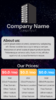
- Tristan M.[DOUBLEPOST=1515772993][/DOUBLEPOST]To give my criticism a firm footing I've made a new version of this (Pretty much the same.)
It incorporates all of my criticism.
This took me roughly an hour to do, and I would call myself adept, but not expert in this field.
Attachments
Last edited:
Thanks, yes i’m bad, i’ve never really edited photos etc, this was just something quick I made while in class lol. I’ll take your tipsThreat =/= Thread.
The design is quite frankly put very bad. It needs to be fixed up a whole lot before it could even be presentable as free;
The colors are just off, and very unappealing to the eyes.
A simple fix would be to use this as a guide: https://flatuicolors.com/
Font Choice is really atrocious, if you are using Paint, or another simple image editor I would recommend switching to something more complex, something with either a large font library, or something that you can import into.
Edges on the elements that have different colors should be cleaned up (Rounded), and a border added.Just my 2-cents
Use something that supports PNG image files with transparent backgrounds, the logo above company name would look 1000x better with a transparent background.
Text should be centered, bulleted, and properly sized as well.
A lot of effort goes into good GFX work, and this does not reflect care and affection, if this is the best you can make I'd recommend practicing a lot more before trying to sell your work. Possibly doing free commissions to train yourself, and looking at other GFX artists to compare work, and take away from their technique.
- Tristan M.[DOUBLEPOST=1515772993][/DOUBLEPOST]To give my criticism a firm footing I've made a new version of this (Pretty much the same.)
It incorporates all of my criticism.
This took me roughly an hour to do, and I would call myself adept, but not expert in this field.
- Status
- This thread has been locked.
