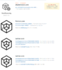
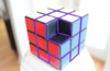
Opinions on whether or not this logo is considered a copy

Status
This thread has been locked.

ZDesigns

Retired Moderator
Supreme
Feedback score
27
Posts
900
Reactions
610
Resources
0
I recently made a logo for a build team. The client was concerned that this logo is considered a copy, which will poorly reflect on their brand's image.

My argument is that I used basic concepts and combined them to create a unique logo. The idea was to have an isometric "A" with a piece taken out of it to represent a Minecraft block.

Image 2019-03-05 at 6.55.31 PM.png

93460687.png

Image 2019-03-08 at 5.34.51 PM.png

What are your opinions on this matter?

Note that upon the client's request, they will be refunded. Additionally, this logo is now for sale; pm with offers.
 

Attachments

  • Image 2019-03-05 at 6.55.31 PM.png
    Image 2019-03-05 at 6.55.31 PM.png
    45.3 KB · Views: 102
  • 93460687.png
    93460687.png
    120.4 KB · Views: 105
  • Image 2019-03-08 at 5.34.51 PM.png
    Image 2019-03-08 at 5.34.51 PM.png
    284.5 KB · Views: 98
Last edited:
PebbleHost
High performance, consistent uptime and fast support. Minecraft hosting that just works.

RavitsART

Feedback score
14
Posts
435
Reactions
84
Resources
0
When it comes to illustration its of much easier to say if somethings a copy, since things are more complex/detailed usually,
(so like if i were to compare the look you have for your design and that other logo to an illustration, it would be like taking a portrait drawing, and then changing some facial features a bit and maybe adding glasses) but for something as simple as a basic square flat design, there are not that many choices one can make, the designs are gonna get repeated, many times not even intentionally.
I do wonder, if removing that bottom plane from that middle missing chunk would make it look better, would be less like the other logo and look more like an A since an A has an empty hole in the middle... I'm just rambling at this point, sorry xD
 
Status
This thread has been locked.
Top