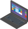
I've recently got into illustrations and found a fun hobby, which is to make isometric illustrations which are basically 3d illustrations. I've made my first one and am wondering if the quality is on par to being sold, and whether this style would be demanded or not. Please keep this thread on topic.

Navigation
-
-
Standalone Tebex Templates & themes Websites Pterodactyl Themes Addons Eggs NamelessMC Templates Modules XenForo Themes Addons Invision Community Themes Plugins Translations WHMCS Themes Modules Paymenter Themes Extensions Calagopus Themes Extensions Eggs LeaderOS themes Ghost themes Shopify themes Wix themes Squarespace themes Other webstores CraftingStore templates MineStore themes PayNow templates Other
-
-
-
Install the app
More options
You are using an out of date browser. It may not display this or other websites correctly.
You should upgrade or use an alternative browser.
You should upgrade or use an alternative browser.
Opinions
- Thread starter YahiaShaker
- Start date
- Status
- This thread has been locked.
PebbleHost
High performance, consistent uptime and fast support. Minecraft hosting that just works.
The gradient shouldn't repeat itself as each key will have a different shadow depending on the location of your light source. I also noticed you have nothing connecting the laptop screen to the keyboard. It's a very minor detail but definitely one that stands out if you look at it long enough. Back to the gradient, I personally find that using gradients in such minimal designs ruins them. It looks very amateur as if you didn't know what to detail the keys with. If you simply just add the QWERTY keyboard letters to it and remove the gradient it would look great (Obviously make sure they fit into perspective.) I'm not sure how small or large it will be used but little details matter. Please keep in mind these are just my opinions, do whatever you feel looks best.
Thanks everyone for your feedback, I didn’t expect this much feedback. Also, the image attached is around 3kx3k pixels and if I’m going to use it in designs I’m going to shrink it to around 200x200 so the minor details don’t really matter, but I’ll keep in mind what you guys said in my next illustrations. Thanks again guys
- Status
- This thread has been locked.