
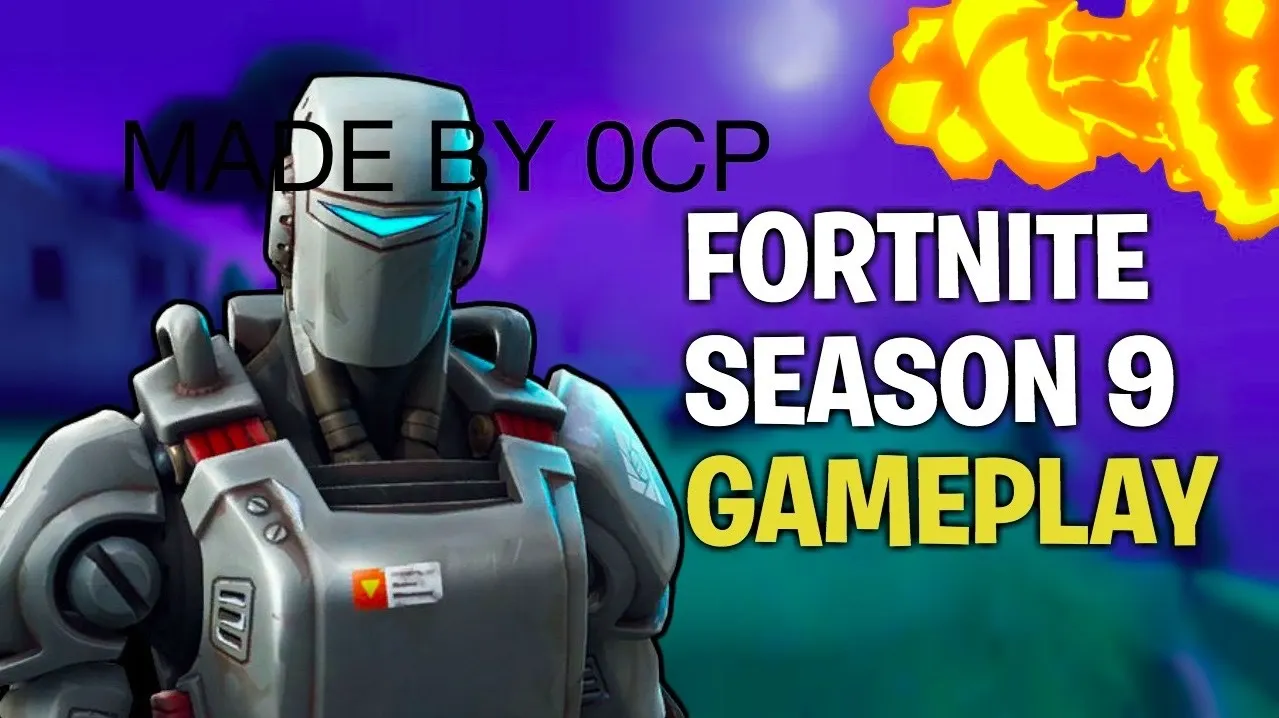
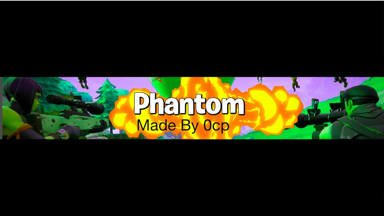
Hey guys! I wanted to ask for some advice for my new graphics, and your thoughts!
Thank you to everyone who helps, all of you are appreciated

I'm open to criticism


Hey! So work on the colors
font
text style
background
color correction[DOUBLEPOST=1557396109][/DOUBLEPOST]take a look at this video :

I agree with oofing, id say after all of this try to work on focal length aswell - i noticed that can help alot with a piece!
Heres a video i added for you incase you are interested:
I'd agree with thatI dont know if this goes into what the other guys said since I have no experience in graphics, but the fire in both of those pics looks quite out of place. Maybe cause it feels like it has no depth and/or it just clearly shouldn't go where it is?
Thank you for your feedback![DOUBLEPOST=1557468840][/DOUBLEPOST]
Thanks so much!Yea as the others said above!
Work on your fonts, background and keep a specific style for the design ur making.. Its ok to add some other effects here and there!
But its better to stick to the theme!
This comes with practice! Watch more videos regarding GFX Design and try to challenge yourself to create stunning graphics!
In my opinion you should watch this YouTuber called Seso
Good Luck in making more GFX



