opinions? most stuff is a WIP, and some just for fun. especially the Dribbble one, I have a different idea for when I am good enough for Dribbble.


Attachments
-
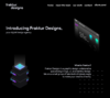 Desktop HD Copy [email protected]436.2 KB · Views: 69
 -
 artsydum.png840.6 KB · Views: 68
 -
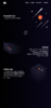 ddgsketchofnewsite.png12.7 MB · Views: 75
 -
 ddgsketchofnewsite.png12.7 MB · Views: 12
 -
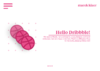 notdonedribbble.png498.1 KB · Views: 69
