
Attachments
Last edited:
Paint.exe
10/10, a1 shading. I wanna see more")
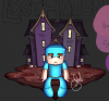
I really enjoy it. I just think that the proportion of human to building is a little off. But its still very nice.
You're right. Logically, a human shouldn't be that large or a house shouldn't be that small in comparison to one another. However, when it comes to these hand-drawn logos, it's less about realistic proportion and more about artistic balance.I really enjoy it. I just think that the proportion of human to building is a little off. But its still very nice.
Ah okay. I don't do drawn art. I do renders. I guess you learn something new everyday! ThanksYou're right. Logically, a human shouldn't be that large or a house shouldn't be that small in comparison to one another. However, when it comes to these hand-drawn logos, it's less about realistic proportion and more about artistic balance.
If I were to make the building any large or the character any smaller, it would throw off the weight of the logo and make the entire thing feel awkward and lopsided. You see this all the time in MC Server logos, and especially in Totally's artwork.
Looks epicMade By Soul For my Server Lost Haven. Please rate the logo out of 10 Thanks.
Agreed with all above comments, artwork is absolutely magnificent!


