Navigation
-
-
Standalone Tebex Templates & themes Websites Pterodactyl Themes Addons Eggs NamelessMC Templates Modules XenForo Themes Addons Invision Community Themes Plugins Translations WHMCS Themes Modules Paymenter Themes Extensions Calagopus Themes Extensions Eggs LeaderOS themes Ghost themes Shopify themes Wix themes Squarespace themes Other webstores CraftingStore templates MineStore themes PayNow templates Other
-
-
-
Install the app
More options
You are using an out of date browser. It may not display this or other websites correctly.
You should upgrade or use an alternative browser.
You should upgrade or use an alternative browser.
Rate this finished design?
- Thread starter JumboGraphics
- Start date
- Status
- This thread has been locked.
PebbleHost
High performance, consistent uptime and fast support. Minecraft hosting that just works.
Thankyou!The before image is broken.
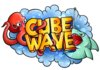
Overall I'd say 9/10. My only complaint is the water bubble stuff is on the shark and octopus, would look better without it imo.
Banned forever. Reason: Creating Multiple Accounts (LineGraphics)
And the water on the shark and octopus is for that when they are out of the water they are wetThe before image is broken.
Overall I'd say 9/10. My only complaint is the water bubble stuff is on the shark and octopus, would look better without it imo.

Banned forever. Reason: Creating Multiple Accounts (LineGraphics)
Ha! Thats what its based onLooks very cute! The octopus reminds me of Hank from Finding Dory.
The owners nick name is Hank
Last edited:
Banned forever. Reason: Creating Multiple Accounts (LineGraphics)
Thankyou!7.5/10. The shading could be better.
Banned forever. Reason: Creating Multiple Accounts (LineGraphics)

Looking very good.
But i think mascots shader are better than the font shader. You could improve the text certanly
9.0/10
But i think mascots shader are better than the font shader. You could improve the text certanly
9.0/10
10/10 nothing needs improvement!
I would rate this at an 9/10, the design looks great, and I love the simplistic yet thorough style you utilized to give it that cartoon look. The only suggestion I have is to make the shading on the text more realistic to replace the gradients you are using right now.
- Status
- This thread has been locked.