Navigation
-
-
Standalone Tebex Templates & themes Websites Pterodactyl Themes Addons Eggs NamelessMC Templates Modules XenForo Themes Addons Invision Community Themes Plugins Translations WHMCS Themes Modules Paymenter Themes Extensions Calagopus Themes Extensions Eggs LeaderOS themes Ghost themes Shopify themes Wix themes Squarespace themes Other webstores CraftingStore templates MineStore themes PayNow templates Other
-
-
-
Install the app
More options
You are using an out of date browser. It may not display this or other websites correctly.
You should upgrade or use an alternative browser.
You should upgrade or use an alternative browser.
Resource Page layout messed up
- Thread starter AnarchyCraft
- Start date
- Status
PebbleHost
High performance, consistent uptime and fast support. Minecraft hosting that just works.

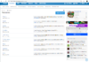
lmfao. It's not a bug. It's a more organised way to layout the resources.So when ever I click on resource I see this now, View attachment 247411
Is there a way to fix this or is this a website bug?
Yeah but was it just recently uploaded because yesterday when I clicked on resources It looks like what it looks when you click pluginslmfao. It's not a bug. It's a more organised way to layout the resources.
If you knew it was an update, why call it a bug? confusion.Yeah but was it just recently uploaded because yesterday when I clicked on resources It looks like what it looks when you click plugins
I didn't know it was an actual function because I didn't read any update notes so i thought it was a bug at the time I posted thisIf you knew it was an update, why call it a bug? confusion.


We’re looking to increase the exposure of our resource author’s resources to the people who are the most likely to be interested in purchasing/downloading them. Thus, we’re starting with experiments on the layout of our categories display page.
I believe what Mick’s looking for is to have resource categories display similarly to forum categories. Input is always welcome.
I believe what Mick’s looking for is to have resource categories display similarly to forum categories. Input is always welcome.
We’re looking to increase the exposure of our resource author’s resources to the people who are the most likely to be interested in purchasing/downloading them. Thus, we’re starting with experiments on the layout of our categories display page.
I believe what Mick’s looking for is to have resource categories display similarly to forum categories. Input is always welcome.
In my opinion it's way worse than before.
I always looked on the resource page finding something interesting for me, it could be builds, plugins... Now I can't look into all resources, I need to be more specific..
All of us "resource creators" were good with the old resource homepage, why you didn't leave it like it was before or just make a poll? Just asking.
Thanks
")
I'm not sure if something like so would be possible, but replacing the text with the last 5 updated resources per section may look good. It would at least add some color to the page as it really looks black and white currently rather than creative and colorful with icons - I hope I explained that correctly, I mean it looks really plain. I didn't have any issues with the original layout.
https://prnt.sc/oki4da
https://prnt.sc/oki4da
We all want the old design!


After seeing the negativity from this design we reverted back to the old design, but currently we're trying something new.
As others have said this wasn't a bug, it was just a failed attempt to change the index page. I'll move this to the bug report archives, thank you
As others have said this wasn't a bug, it was just a failed attempt to change the index page. I'll move this to the bug report archives, thank you
- Status