Navigation
-
-
Standalone Tebex Templates & themes Websites Pterodactyl Themes Addons Eggs NamelessMC Templates Modules XenForo Themes Addons Invision Community Themes Plugins Translations WHMCS Themes Modules Paymenter Themes Extensions Calagopus Themes Extensions Eggs LeaderOS themes Ghost themes Shopify themes Wix themes Squarespace themes Other webstores CraftingStore templates MineStore themes PayNow templates Other
-
-
-
Install the app
More options
You are using an out of date browser. It may not display this or other websites correctly.
You should upgrade or use an alternative browser.
You should upgrade or use an alternative browser.
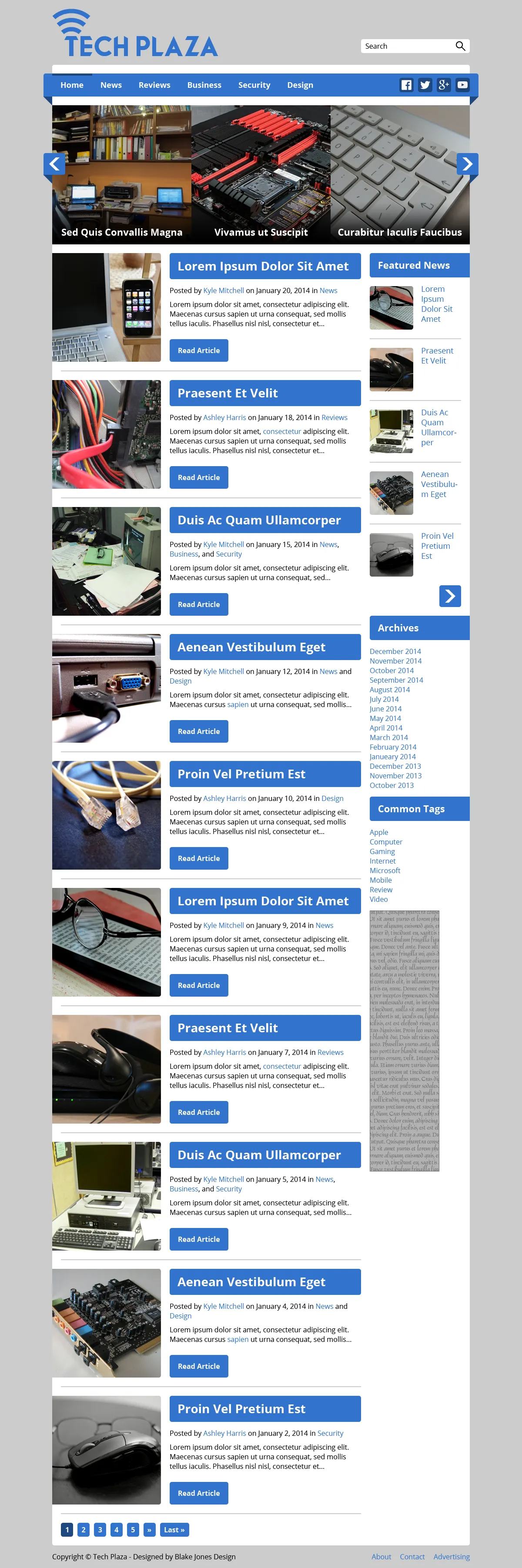
This look good as a site (Not designed by me)
- Thread starter ArcheonTV
- Start date
- Status
- This thread has been locked.


PebbleHost
High performance, consistent uptime and fast support. Minecraft hosting that just works.
Ah, well I bought this for $200, have to pay another $25 for it to become mobile optimized, and then another $20 to the designer to make a similar logo for this site. Its mainly going to be about hardware and software, just wanted to see some peoples opinions. Thanks ErikPersonally don't like it, all the blue is too thick and the white background for each article's "thumbnail" is abruptly cut off. However I do like the slideshow of different articles.

Banned forever. Reason: Account compromised

ThanksI think it's fine, but the background should be a lighter blue and the labels should be the light gray instead of the thick blue.
Banned forever. Reason: Account compromised
- Status
- This thread has been locked.
