Navigation
-
-
Standalone Tebex Templates & themes Websites Pterodactyl Themes Addons Eggs NamelessMC Templates Modules XenForo Themes Addons Invision Community Themes Plugins Translations WHMCS Themes Modules Paymenter Themes Extensions Calagopus Themes Extensions Eggs LeaderOS themes Ghost themes Shopify themes Wix themes Squarespace themes Other webstores CraftingStore templates MineStore themes PayNow templates Other
-
-
-
Install the app
More options
You are using an out of date browser. It may not display this or other websites correctly.
You should upgrade or use an alternative browser.
You should upgrade or use an alternative browser.
Thread Design
- Thread starter Banned
- Start date
- Status
- This thread has been locked.


PebbleHost
High performance, consistent uptime and fast support. Minecraft hosting that just works.
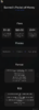
Yeah, I didn't want to go to wild on it, just clean and simple.I think its fairly plain.
Thank you.I think the numbers are unnecessary the first time I looked at it I didn't even notice it.
It is a little bit plain but I would say that this is a quite good foundation for a thread design. :tup:
Thanks a lot.In my opinion, it's a very simple thread design. Not everyone can pull off a simple design, but you certainly can. It's high quality and looks great. I love the color scheme you chose and the layout.
Only thing I recommend not doing is using images in the shape of letters, such as "o" unless the image(s) is the same color scheme as the background.
Thanks a lot.
This makes me uncomfortable , idc if it couldn't fit, just please don't drive this scuba steve crazy ;-;
Attachments

I'll change itView attachment 227428
This makes me uncomfortable , idc if it couldn't fit, just please don't drive this scuba steve crazy ;-;

Scuba Steve approvesI'll change it
- Status
- This thread has been locked.