$5 Paypal for best website/typography advice!

Status
This thread has been locked.

Nitr0us

Manager | Developer
Supreme
Feedback score
4
Posts
157
Reactions
95
Resources
0
1) The colours don't match at all, I suggest you check out this colour wheel to see colours that match -
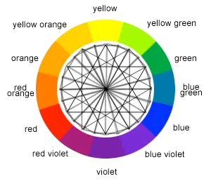
color-wheel.png

2) Remove the gif writing in the middle, remove the text of your company, put a nice company logo there, if you do use text, don't use times new roman.

3) Remove the girl.

4) Remove the giant discord logo, just have it say you can contact us on discord and have a small discord logo (just the eye thing part)

5) remove that part where it says sevi and mike coded the site

6) for the top part of the site find a better background image and don't add a photo filter on it, just keep it blank.

7) Change the buttons.

Also, if you need help or someone to redo all the colours and fonts on your site and just make everything look way more pretty I can do that.
 

sevdeawesome

Banned
Feedback score
1
Posts
210
Reactions
54
Resources
0
1) The colours don't match at all, I suggest you check out this colour wheel to see colours that match -
color-wheel.png

2) Remove the gif writing in the middle, remove the text of your company, put a nice company logo there, if you do use text, don't use times new roman.

3) Remove the girl.

4) Remove the giant discord logo, just have it say you can contact us on discord and have a small discord logo (just the eye thing part)

5) remove that part where it says sevi and mike coded the site

6) for the top part of the site find a better background image and don't add a photo filter on it, just keep it blank.

7) Change the buttons.

Also, if you need help or someone to redo all the colours and fonts on your site and just make everything look way more pretty I can do that.
The color scheme is a triad color scheme http://paletton.com/#uid=3000u0kkHq4eXE1cNA8rdjdqgfb
The buttons are changed and I replaced the girl with a picture of my friend with headphones on due to previous suggestions, most of those were already suggested, I think Sapfire still has the win right now but thank you for the input! By the way a lot of those things have been implemented since youve typed it as Im working on the site while reading these. You can see the updated version now at http://sevnet.co/sevistest/
 
Banned forever. Reason: Ban Evading (his)

NotSoBoop

New Developer
Premium
Feedback score
23
Posts
963
Reactions
345
Resources
0
Here is a list of my suggestions (Not a designer, so please take this with a grain of salt):

  • You are a hosting company, I believe you need to use professional colors. The red, blue, and pink don't really look "professional", but could add some spice into a logo.
    • You can use this to help you find the perfect combinations for colors. Gives HEX codes and everything!
  • Use a navbar that's custom designed. If it looks Bootstrappy, looks like no effort was put into it. Something like the 4th one here would look nice, if the logo correctly complements it.
    • Make 100% sure the navbar isn't visible when the jumbotron is visible, only after it is scrolled.
  • Instead of having a jumbotron like this (http://prntscr.com/ft28vk), have a jumbotron with a nice image background (maybe an image of a datacenter that is slightly blurred) and your logo around 5% above the center of the page. You can throw that typing effect in font size 15 that advertises your site (I love typing effects lol)
  • Responsiveness on your website is quite lacking, I'd recommend using some sort of grid system (like Bootstrap) in order to help out with that. (If you use Bootstrap, don't be afraid to make custom modifications to it!)
  • Add more comments to the website code, helps make the code cleaner. Also, fix those div names. "noob" doesn't seem very professional (code it as if everybody who visits the website will inspect element it)
  • The cuts on your website could be a lot nicer. Simply just cutting between different background colors without any outline effects could work, or using clearly defined headers, but I personally would prefer some sort of nice gradient in switching between the two.
  • Use animations to add emphasis on certain features, currently the website feels like a huge wall of boring text
    • Any hover effects should be nice and smooth, your currently has a short period in which it becomes transparent, which kinda annoys me. Could be annoying to other users as well.
    • Remember: Too much of anything WILL make it bad. Don't overdo the animations
  • Just get rid of the person in the image. It's not that it looks sketchy for me, but that it is poorly edited and extremely out of place.
  • The strikethrough on your website (http://prntscr.com/ft2bza) is exactly what I think would make a good transition, and the same for the text below it. However, the text color kills it, so it looks out of place.
  • Make sure your text lines up. Even if this means shortening (if you need to lengthen something, you're probably going into too much detail) [Example of bad implementation on your website: http://prntscr.com/ft2cjs].
    • PLEASE MAKE SURE TITLES LINE UP
      • THIS IS SO IMPORTANT I CAPITALIZE IT
        • AND HAVE A LOT OF SUBBULLETS FOR IT
          • SO IMPORTANT THAT I AM EVEN FORMATTING THIS TEXT
            • So, please make sure those titles line up.
  • The "Website coded by x" doesn't look good, I think would serve much better as a comment spread throughout the code.
  • The footer should normally have information about the company, and should be split into 3 sections.
    • The left side should contain:
      • Company logo (minimized)
      • A short description (max 50 words) about the company
    • The center should contain:
      • Either a Google map implemented to show location of the company
      • Company office location
      • Company contact email
      • (Optional, but if you really want this should be a part of the website) A list of your partners, complemented with images)
      • Centered at the bottom should be:
        • Privacy Policy
        • Terms of Service / Fair Use Policy [Since you're a hosting company]
    • The right side should contain:
      • Any social media presence you have
      • The live chat (if you have it)
      • Any other extracurriculars you think you'd need
  • The footer shouldn't be too big, nor too small. The size you have now seems fine, but seems empty.
  • Last but not least:
    • Empty space (to me) is an amazing design tactic, but you simply have way too much.
    • Make sure to utilize empty space on the website as efficiently as possible.
      • No empty space on a website is a website with too much content. A majority empty space on a website is a website with too little content.
      • I personally believe the jumbotron should be 0% empty space (with image and text), however all proceeding sections should have the left and right of it complemented with empty space, with heavy emphasis on the middle (unless you need the side, then make sure to use empty space between each element, but not too much)

So, this was my comprehensive list of what I think needs to be done to the website. There is still room for improvement, so I may edit this as I discover things.[DOUBLEPOST=1499489368][/DOUBLEPOST]Apparently can't edit, so just want to add one more thing:

  • As a hosting company, do not guarantee on your website what you cannot fulfill.
  • Make sure ALL COLORS complement each other (even hover effects)
    • Black and white can complement almost anything, as long as they are used effectively, not thrown into the middle of a color vomit.
[DOUBLEPOST=1499489448][/DOUBLEPOST]Also, make sure all links on your website work. The discord link currently does not.
 
Last edited:

Safdar

Designer
Supreme
Feedback score
32
Posts
948
Reactions
377
Resources
0
Use light colours and make it look very fancy and modern.
White-ish colours makes it look modern.
Or use Colours like these matching colours like this.
Or maybe this type of red with this.
Keeping the letters in bold also look good.
Make the texts big. Use fonts like minecraft.net because they look very fancy.
 

sevdeawesome

Banned
Feedback score
1
Posts
210
Reactions
54
Resources
0
Here is a list of my suggestions (Not a designer, so please take this with a grain of salt):

  • You are a hosting company, I believe you need to use professional colors. The red, blue, and pink don't really look "professional", but could add some spice into a logo.
    • You can use this to help you find the perfect combinations for colors. Gives HEX codes and everything!
  • Use a navbar that's custom designed. If it looks Bootstrappy, looks like no effort was put into it. Something like the 4th one here would look nice, if the logo correctly complements it.
    • Make 100% sure the navbar isn't visible when the jumbotron is visible, only after it is scrolled.
  • Instead of having a jumbotron like this (http://prntscr.com/ft28vk), have a jumbotron with a nice image background (maybe an image of a datacenter that is slightly blurred) and your logo around 5% above the center of the page. You can throw that typing effect in font size 15 that advertises your site (I love typing effects lol)
  • Responsiveness on your website is quite lacking, I'd recommend using some sort of grid system (like Bootstrap) in order to help out with that. (If you use Bootstrap, don't be afraid to make custom modifications to it!)
  • Add more comments to the website code, helps make the code cleaner. Also, fix those div names. "noob" doesn't seem very professional (code it as if everybody who visits the website will inspect element it)
  • The cuts on your website could be a lot nicer. Simply just cutting between different background colors without any outline effects could work, or using clearly defined headers, but I personally would prefer some sort of nice gradient in switching between the two.
  • Use animations to add emphasis on certain features, currently the website feels like a huge wall of boring text
    • Any hover effects should be nice and smooth, your currently has a short period in which it becomes transparent, which kinda annoys me. Could be annoying to other users as well.
    • Remember: Too much of anything WILL make it bad. Don't overdo the animations
  • Just get rid of the person in the image. It's not that it looks sketchy for me, but that it is poorly edited and extremely out of place.
  • The strikethrough on your website (http://prntscr.com/ft2bza) is exactly what I think would make a good transition, and the same for the text below it. However, the text color kills it, so it looks out of place.
  • Make sure your text lines up. Even if this means shortening (if you need to lengthen something, you're probably going into too much detail) [Example of bad implementation on your website: http://prntscr.com/ft2cjs].
    • PLEASE MAKE SURE TITLES LINE UP
      • THIS IS SO IMPORTANT I CAPITALIZE IT
        • AND HAVE A LOT OF SUBBULLETS FOR IT
          • SO IMPORTANT THAT I AM EVEN FORMATTING THIS TEXT
            • So, please make sure those titles line up.
  • The "Website coded by x" doesn't look good, I think would serve much better as a comment spread throughout the code.
  • The footer should normally have information about the company, and should be split into 3 sections.
    • The left side should contain:
      • Company logo (minimized)
      • A short description (max 50 words) about the company
    • The center should contain:
      • Either a Google map implemented to show location of the company
      • Company office location
      • Company contact email
      • (Optional, but if you really want this should be a part of the website) A list of your partners, complemented with images)
      • Centered at the bottom should be:
        • Privacy Policy
        • Terms of Service / Fair Use Policy [Since you're a hosting company]
    • The right side should contain:
      • Any social media presence you have
      • The live chat (if you have it)
      • Any other extracurriculars you think you'd need
  • The footer shouldn't be too big, nor too small. The size you have now seems fine, but seems empty.
  • Last but not least:
    • Empty space (to me) is an amazing design tactic, but you simply have way too much.
    • Make sure to utilize empty space on the website as efficiently as possible.
      • No empty space on a website is a website with too much content. A majority empty space on a website is a website with too little content.
      • I personally believe the jumbotron should be 0% empty space (with image and text), however all proceeding sections should have the left and right of it complemented with empty space, with heavy emphasis on the middle (unless you need the side, then make sure to use empty space between each element, but not too much)
So, this was my comprehensive list of what I think needs to be done to the website. There is still room for improvement, so I may edit this as I discover things.[DOUBLEPOST=1499489368][/DOUBLEPOST]Apparently can't edit, so just want to add one more thing:

  • As a hosting company, do not guarantee on your website what you cannot fulfill.
  • Make sure ALL COLORS complement each other (even hover effects)
    • Black and white can complement almost anything, as long as they are used effectively, not thrown into the middle of a color vomit.
[DOUBLEPOST=1499489448][/DOUBLEPOST]Also, make sure all links on your website work. The discord link currently does not.
Very helpful, I think you're taking the win tbh[DOUBLEPOST=1499490846][/DOUBLEPOST]You're now winning the competition, but itll be over in 2 days, I didnt expect so many responses so quickly
 
Banned forever. Reason: Ban Evading (his)

sevdeawesome

Banned
Feedback score
1
Posts
210
Reactions
54
Resources
0
Banned forever. Reason: Ban Evading (his)
Status
This thread has been locked.
Top
