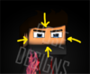
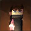
Feedback & value of this avatar

Status
This thread has been locked.

Pose

Premium
Feedback score
12
Posts
175
Reactions
51
Resources
0
Hello! I bought a drawing tablet a few days ago so I could experiment with digital art, and after watching a few tutorials and struggling for quite a while, I came up with my first drawn avatar. Yes, I did use tutorials to a certain extent since I'm pretty new to this whole drawing thing, but I do think this avatar came out alright. I'm looking for feedback, constructive criticism, and monetary value of this avatar. Thanks!
a1ejId9.png
 
PebbleHost
High performance, consistent uptime and fast support. Minecraft hosting that just works.

keilyn

Supreme
Feedback score
42
Posts
213
Reactions
123
Resources
30
Yes, as Patelephone said, you could improve shadings and the direction of the lights, Look for tutorials about that, lights and shadows, it will help you a lot. Also the pressure of the lines too, you have a drawing tablet, use the pressure.

Right now I think you should not care about monetary value of this, focus on improving, I mean dont be offended.
 

Waltey

Feedback score
6
Posts
8
Reactions
8
Resources
0
I disagree, I think your shading is fantastic. I would however recommend to turn on pressure sensitivity on your tablet, or to use a pressure sensitive brush for better lines, personally it doesn't look like it was drawn with a tablet. Strongly recommend looking into how to activate pressure sensitivity if it's off, to use pressure sensitive brushes is a must, and finally I'd work on the hair a little and DON'T use bucket tool, I can see u tried to use it for the eyes and it didn't come out as well as it could've.

updated: search youtube vids on pressure sensitivity, it's a must
 
Last edited:

Azmi

Im sorry if I have been toxic to you in the past
Premium
Feedback score
47
Posts
1,232
Reactions
433
Resources
0
give me the png(without wm) I'll help you shading it
 

JasmineBabe

MineBlur
Premium
Feedback score
2
Posts
25
Reactions
17
Resources
0
$10
 

Pose

Premium
Feedback score
12
Posts
175
Reactions
51
Resources
0
Yes, as Patelephone said, you could improve shadings and the direction of the lights, Look for tutorials about that, lights and shadows, it will help you a lot. Also the pressure of the lines too, you have a drawing tablet, use the pressure.

Right now I think you should not care about monetary value of this, focus on improving, I mean dont be offended.
This may sound really stupid, but how does pressure sensitivity help make it look better? And yeah I really do think I will work on my art for a bit doing VCs and such before selling, I was just wondering what the value of this piece would be.
I disagree, I think your shading is fantastic. I would however recommend to turn on pressure sensitivity on your tablet, or to use a pressure sensitive brush for better lines, personally it doesn't look like it was drawn with a tablet. Strongly recommend looking into how to activate pressure sensitivity if it's off, to use pressure sensitive brushes is a must, and finally I'd work on the hair a little and DON'T use bucket tool, I can see u tried to use it for the eyes and it didn't come out as well as it could've.
Yeah I mainly had trouble with hair and arms. As for the bucket tool, I'll definitely try to use the brush more in the future. Thanks!
give me the png(without wm) I'll help you shading it
Add me on discord: Pose#2869
Thanks!
 

keilyn

Supreme
Feedback score
42
Posts
213
Reactions
123
Resources
30
This may sound really stupid, but how does pressure sensitivity help make it look better? And yeah I really do think I will work on my art for a bit doing VCs and such before selling, I was just wondering what the value of this piece would be.

It will look more harmonious .. But if you do not want to use pressure, it's just my opinion. It looks like a drawing made with the mouse, the purpose of having a drawing tablet is precisely emulate the sheet and the pencil.

About the shadow when I say that you need to practice more that, it's because you cantt put shadow on all four sides of the face for example
ex.png
 

Attachments

  • ex.png
    ex.png
    188.2 KB · Views: 28

Pose

Premium
Feedback score
12
Posts
175
Reactions
51
Resources
0
It will look more harmonious .. But if you do not want to use pressure, it's just my opinion. It looks like a drawing made with the mouse, the purpose of having a drawing tablet is precisely emulate the sheet and the pencil.

About the shadow when I say that you need to practice more that, it's because you cantt put shadow on all four sides of the face for example
View attachment 143104
Hmm yeah I definitely need to learn more about pressure sensitivity and its uses. Thanks for the feedback!
 

cy_

potato
Premium
Feedback score
0
Posts
20
Reactions
50
Resources
0
upload_2018-8-1_9-37-31.png

I'll just leave this here lol
 

Attachments

  • upload_2018-8-1_9-37-31.png
    upload_2018-8-1_9-37-31.png
    402.9 KB · Views: 61

cy_

potato
Premium
Feedback score
0
Posts
20
Reactions
50
Resources
0
Idk why you posted this, but I think the lighting, shadows, and hair look much better. I need some tutorials on how to make good-looking hair lol
Just a visual example on how you could adjust the lighting ^^ In your piece I think in part not just the light source (the flame) but distinguishing the character from the background is also pretty important. It could help if you zoomed out a bunch on your piece to see the thing as a whole than be zeroed in on the thing as you work on it too. Like technicality aside, personally I think clarity is more important to make the figure pop.
The others had already clarified the issues in the piece so as anecdote I decided to make a drawover to better illustrate their points. My personal opinion is that it's just better if I can tell what's going on in the piece at first glance rather than take more than 2 seconds to guess what's going on, since in your original it was really hard to tell where the edges of the clothes were. Make your stuff lighter then work your way to dark~
Skill-wise it's something you'll improve with time anyway (the hair thing), so don't worry too much about stuff like how to draw hair, cuz hell if we ever know how to pull that off lmao. You'll figure it out eventually. I recommend focusing on fixing your immediate needs one at a time then worry about the other stuff later. Tutorials are only useful up til a certain point where you start to figure out what makes you more comfortable drawing, but don't let em curb yer development as an artist. See what you can bend and shift from those as a basis.
 
Last edited:

Pose

Premium
Feedback score
12
Posts
175
Reactions
51
Resources
0
Just a visual example on how you could adjust the lighting ^^ In your piece I think in part not just the light source (the flame) but distinguishing the character from the background is also pretty important. It could help if you zoomed out a bunch on your piece to see the thing as a whole than be zeroed in on the thing as you work on it too. Like technicality aside, personally I think clarity is more important to make the figure pop.
The others had already clarified the issues in the piece so as anecdote I decided to make a drawover to better illustrate their points. My personal opinion is that it's just better if I can tell what's going on in the piece at first glance rather than take more than 2 seconds to guess what's going on, since in your original it was really hard to tell where the edges of the clothes were. Make your stuff lighter then work your way to dark~
Skill-wise it's something you'll improve with time anyway (the hair thing), so don't worry too much about stuff like how to draw hair, cuz hell if we ever know how to pull that off lmao. You'll figure it out eventually. I recommend focusing on fixing your immediate needs one at a time then worry about the other stuff later. Tutorials are only useful up til a certain point where you start to figure out what makes you more comfortable drawing, but don't let em curb yer development as an artist. See what you can bend and shift from those as a basis.
Wow this is great advice, thank you! I do have a few questions for you though:
1. In the remake that you posted earlier, what brushes did you use to make it look like that?
2. The shadows and lighting look really nice in this, try as I might I couldn't really achieve the same effect. Is there a certain technique for shading that artists use for this?
3. I had a lot of trouble with coloring in because I set up my sketch in a bunch of different layers, one for arms, body, head, etc. This forced me to use the lasso tool a lot when filling in the solid colors of the image and it had an effect on the finished product. Do you have any tips as to how I can change this in my next drawing?
Anyways, thanks for everything, you and everyone else on this thread have been very helpful in determining my next course of action, and I really appreciate it.
 

keilyn

Supreme
Feedback score
42
Posts
213
Reactions
123
Resources
30
Just a visual example on how you could adjust the lighting ^^ In your piece I think in part not just the light source (the flame) but distinguishing the character from the background is also pretty important. It could help if you zoomed out a bunch on your piece to see the thing as a whole than be zeroed in on the thing as you work on it too. Like technicality aside, personally I think clarity is more important to make the figure pop.
The others had already clarified the issues in the piece so as anecdote I decided to make a drawover to better illustrate their points. My personal opinion is that it's just better if I can tell what's going on in the piece at first glance rather than take more than 2 seconds to guess what's going on, since in your original it was really hard to tell where the edges of the clothes were. Make your stuff lighter then work your way to dark~
Skill-wise it's something you'll improve with time anyway (the hair thing), so don't worry too much about stuff like how to draw hair, cuz hell if we ever know how to pull that off lmao. You'll figure it out eventually. I recommend focusing on fixing your immediate needs one at a time then worry about the other stuff later. Tutorials are only useful up til a certain point where you start to figure out what makes you more comfortable drawing, but don't let em curb yer development as an artist. See what you can bend and shift from those as a basis.

Now if it makes sense.

When you leave here a drawing obviusly better and just put: I'll just leave this here lol.., without any other explanation, it sounds really arrogant. But w this, Now everything makes sense.

PD: I agree with everything you say, good art ;)
 

cy_

potato
Premium
Feedback score
0
Posts
20
Reactions
50
Resources
0
Wow this is great advice, thank you! I do have a few questions for you though:
1. In the remake that you posted earlier, what brushes did you use to make it look like that?
2. The shadows and lighting look really nice in this, try as I might I couldn't really achieve the same effect. Is there a certain technique for shading that artists use for this?
3. I had a lot of trouble with coloring in because I set up my sketch in a bunch of different layers, one for arms, body, head, etc. This forced me to use the lasso tool a lot when filling in the solid colors of the image and it had an effect on the finished product. Do you have any tips as to how I can change this in my next drawing?
Anyways, thanks for everything, you and everyone else on this thread have been very helpful in determining my next course of action, and I really appreciate it.

1. Just a few ones I found in the clip asset store here and there. Just a disclaimer - brushes don't inherently make you a better artist, it only works well if you're comfortable with what you're using, so just look around, test some, and see what works for you. Like a thing may look cool but it may also not really feel good to use when you try it, ya know?
2. It's not really a technique, it's moreso basic understanding of art fundamentals in light/shadow. I'd recommend doing a few lighting studies on plaster casts or spheres/cubes cuz those really help build your understanding of how it works. Personally, I think just labelling it as "shading" is kinda too vague to cover the full depth of how things actually work in a piece, so probs watch a video explaining how value (in art terms) works.
3. Then...don't use lasso tool? XD Try other methods and see how do. You could make like several versions of the one illustration and see how many methods you can try out whether it's different layer format, brush usage, etc. Even if I tell you how to do it it's not gonna inherently solve your issue for you in the long run.
No problem ^^ you'll get there eventually~ Just keep practicing and experimenting :3
I'm trying not to give you like, an absolute thing you gotta do in my advice because I'm a strong believer that everyone's processes are different and unique, so good luck yo.
 

Pose

Premium
Feedback score
12
Posts
175
Reactions
51
Resources
0
1. Just a few ones I found in the clip asset store here and there. Just a disclaimer - brushes don't inherently make you a better artist, it only works well if you're comfortable with what you're using, so just look around, test some, and see what works for you. Like a thing may look cool but it may also not really feel good to use when you try it, ya know?
2. It's not really a technique, it's moreso basic understanding of art fundamentals in light/shadow. I'd recommend doing a few lighting studies on plaster casts or spheres/cubes cuz those really help build your understanding of how it works. Personally, I think just labelling it as "shading" is kinda too vague to cover the full depth of how things actually work in a piece, so probs watch a video explaining how value (in art terms) works.
3. Then...don't use lasso tool? XD Try other methods and see how do. You could make like several versions of the one illustration and see how many methods you can try out whether it's different layer format, brush usage, etc. Even if I tell you how to do it it's not gonna inherently solve your issue for you in the long run.
No problem ^^ you'll get there eventually~ Just keep practicing and experimenting :3
I'm trying not to give you like, an absolute thing you gotta do in my advice because I'm a strong believer that everyone's processes are different and unique, so good luck yo.
Alright yeah I'll continue working and doing some free work for people to get better. Thanks a bunch for the advice!
 

cy_

potato
Premium
Feedback score
0
Posts
20
Reactions
50
Resources
0
Alright yeah I'll continue working and doing some free work for people to get better. Thanks a bunch for the advice!
Mm, would be good to do work for yourself too. Doing work for others is great but don't end up devaluing yourself as an artist in the process. Draw things you enjoy as well, or want to get better at. Cover more bases while you're at it \o/
 
Status
This thread has been locked.
Top