Thoughts on new logo?

Status
This thread has been locked.

SapFireMC

Banned
Feedback score
8
Posts
426
Reactions
222
Resources
0
Tbh clickbait title and if you're looking at this, well you fell for it. I guess I misspelled "thoughts".

Anyways, I've just started learning adobe illustrator for the first time yesterday night. This is my second project that I've done, and I personally feel pretty proud of it.

Sketch on paper: (hard to see cuz the scanner on my printer has practically no sensitivity)
EZrdMe6.png

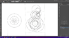
After that I plugged that bad boi into my workspace and started to use the Golden Ratio circles to make up my logo
upload_2018-8-26_14-59-55.png

I cut out the access parts which makes up the shape of the S. Pretty difficult to see exactly what you're cutting out so I had to constantly hide my circle layer and turn it back on. After that, I did some manual smoothing on the edges to make it look more natural, and then I did some pen tooling to make the sharp edges, and to split them off into sections. Too bad I didn't take a screenshot of this step, but this took the longest time for some reason. After that, well comes the fun part, putting the gradients on each section. Also pretty time consuming because I needed to find good gradients that contrast each other yet flow nicely. Then, you know, add some text and whala.
Finished product:
k1pn1uq.png

Total completion time: 4 hours

So wut are your thotughts on this logo? Rating out of 10 maybe? Would you buy it? How much? Everything is appreciated :D
 

Attachments

  • upload_2018-8-26_14-59-55.png
    upload_2018-8-26_14-59-55.png
    294.2 KB · Views: 108
Last edited:
PebbleHost
High performance, consistent uptime and fast support. Minecraft hosting that just works.

Sean

Cinematographer with a dream.
Supreme
Feedback score
25
Posts
219
Reactions
94
Resources
0
Bottom part reminds me of firefox :) That looks amazing btw! Your a lot better at photoshop then me xD 10/10
 

Lacroix

creativity at its finest!
Supreme
Feedback score
40
Posts
1,663
Reactions
771
Resources
0
That's Illustrator.
Bottom part reminds me of firefox :) That looks amazing btw! Your a lot better at photoshop then me xD 10/10

& SapFireMC maybe add a S before the text because if I wasn't looking at your name I would've thought it was ApfireMC not SapFireMC
or maybe move the text to the side of the logo because its hard to see what the "S" stands for when they aren't connected.
 

sHamre99

No motivation results in no reaction
Supreme
Feedback score
3
Posts
62
Reactions
8
Resources
0
Thats sexy af, 10/10
 

MTG

Supreme
Feedback score
78
Posts
2,456
Reactions
2,600
Resources
0
yeah keep going
 
Last edited:
Status
This thread has been locked.
Top