Navigation
-
-
Standalone Tebex Templates & themes Websites Pterodactyl Themes Addons Eggs NamelessMC Templates Modules XenForo Themes Addons Invision Community Themes Plugins Translations WHMCS Themes Modules Paymenter Themes Extensions Calagopus Themes Extensions Eggs LeaderOS themes Ghost themes Shopify themes Wix themes Squarespace themes Other webstores CraftingStore templates MineStore themes PayNow templates Other
-
-
-
-
Install the app
More options
You are using an out of date browser. It may not display this or other websites correctly.
You should upgrade or use an alternative browser.
You should upgrade or use an alternative browser.
Hot Summer Deals are Here!
Celebrate with up to 90% off on 13,300 resources
04
Days
20
Hours
35
Mins
19
Secs
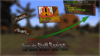
Thoughts on thumbnail?
- Thread starter Zyaf
- Start date
- Status
- This thread has been locked.
PebbleHost
High performance, consistent uptime and fast support. Minecraft hosting that just works.
What font is that?In my opinion, (idk if this has been said or not) the bottom text really is bad. Try using a different, thicker font, don't use the glow but a nice strong drop shadow, but not to heavy. You can use just a simple white text with thick black outline + a drops hadow. Maybe add a "glow" to it, show in this example.
Not the best example, just made it quickly. But my idea^
Either way, goodluck with your thumbnail man haha")
Plumpfull Black fontWhat font is that?
Thank you so much, I'll put that in ASAP.

To be honest, it's decent but it needs work.
Tip #1:
Don't use any of the built in photoshop gradients, but if you do click the "color overlay" option, select a color, and lower the opacity. I do that sometimes.
Tip #2:
Go the the select feature and right click, and click the free transform option. The angles & size of all of the objects on the screen matter a lot.
Tip #3:
Use more fonts. Fonts for thumbnails I really suggest are American Captain & BigNoodleTitling. You can find these on https://www.dafont.com
It seems like he's just starting, don't be that hurtful? Give him tipsYea looks like its cheap
Arrow looks like shit
And like awesome said empty or shit for a lack of better words
Thanks for the advice man, and yes I have just started.To be honest, it's decent but it needs work.
Tip #1:
Don't use any of the built in photoshop gradients, but if you do click the "color overlay" option, select a color, and lower the opacity. I do that sometimes.
Tip #2:
Go the the select feature and right click, and click the free transform option. The angles & size of all of the objects on the screen matter a lot.
Tip #3:
Use more fonts. Fonts for thumbnails I really suggest are American Captain & BigNoodleTitling. You can find these on https://www.dafont.com
It seems like he's just starting, don't be that hurtful? Give him tips
To be honest, it's decent but it needs work.
Tip #1:
Don't use any of the built in photoshop gradients, but if you do click the "color overlay" option, select a color, and lower the opacity. I do that sometimes.
Tip #2:
Go the the select feature and right click, and click the free transform option. The angles & size of all of the objects on the screen matter a lot.
Tip #3:
Use more fonts. Fonts for thumbnails I really suggest are American Captain & BigNoodleTitling. You can find these on https://www.dafont.com
It seems like he's just starting, don't be that hurtful? Give him tips
Attachments
Last edited:
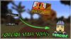
Center the forcide logo and stroke it with the color white & put a outer glow as well
Hi. So, it seems like you are just rotating images and sticking them onto a background. I don't think the arrow is wise, because it shows that the thumbnail is unclear. You should maybe try a different style, but also the color scheme does not fit. I wish you luck.
It looks fine, It is just way too empty and the arrow is very bad, otherwise, it's alright
- Status
- This thread has been locked.