What do you think of the new Discord changes?

What do you think of the new Discord changes?

  • I unironically like this one better

    Votes: 9 16.1%
  • Not bad I guess

    Votes: 8 14.3%
  • Could've done better but it's ok

    Votes: 13 23.2%
  • Ew. Just ew.

    Votes: 23 41.1%
  • Don't care, f*** Discord

    Votes: 3 5.4%

  • Total voters
    56
Status
This thread has been locked.

Unavailable

Inactive (Kinda)
Supreme
Feedback score
4
Posts
361
Reactions
188
Resources
0
Um...
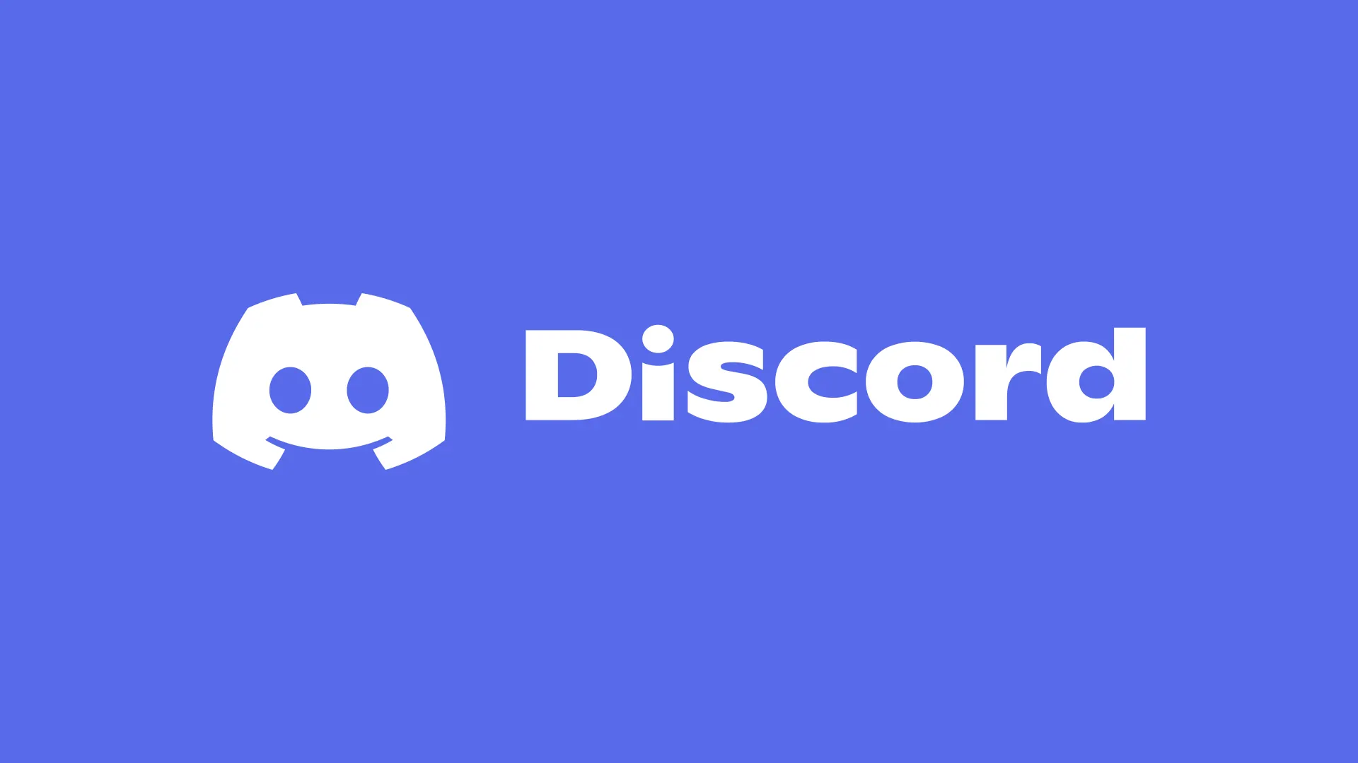
The font is the worst one imo
E1RnbS_VcAg4B5C


1500x500


Capture.png
 
Last edited:
PebbleHost
High performance, consistent uptime and fast support. Minecraft hosting that just works.

PixelMine

PixelMine.com
Ultimate
Feedback score
12
Posts
191
Reactions
237
Resources
1,083
This is an improvement! The illustrations are kinda cool. I'm not a fan of the font or the colour.

upload_2021-5-14_14-48-28.png
 

Attachments

  • upload_2021-5-14_14-48-28.png
    upload_2021-5-14_14-48-28.png
    24.3 KB · Views: 208

Ambrosia

Premium
Feedback score
22
Posts
2,340
Reactions
1,384
Resources
0
Who cares lmao, pay way too much attention to the small things. Just don't use it if you don't like it.
 

Brandon

Developer
Premium
Feedback score
6
Posts
549
Reactions
313
Resources
0
The new colour is too bold and in-your-face
The font makes this app look like its for young children
The logo now looks too blocky and jagged, there's less smooth lines
I cannot find anything I like with this new logo, I hate it
 

Unavailable

Inactive (Kinda)
Supreme
Feedback score
4
Posts
361
Reactions
188
Resources
0
Who cares lmao, pay way too much attention to the small things. Just don't use it if you don't like it.
Nothing wrong with discussing things like this, everyone has different opinions and I wanted to see MC-M's reactions to these Discord changes :)
 

ChitterChatter

Owner of Explorer's Bay
Supreme
Feedback score
4
Posts
117
Reactions
36
Resources
0
I think it's an improvement from what I have seen so far.

The font doesn't bother me, it's different, so to me it stands out a bit more.
And by different, I mean it's not just like Arial or a standard one out there.
 

PixelMine

PixelMine.com
Ultimate
Feedback score
12
Posts
191
Reactions
237
Resources
1,083
Actually I was wrong about the logo, they changed it last year even :)

But the text still bugs me... not the font exactly but the floqw of the letters at the top. My eye gets caught in this bump on the I where it dips below the mid line and even after I read it my eye pops back to that position. It's an akward flow to the text.

upload_2021-5-15_10-51-12.png
 

Attachments

  • upload_2021-5-15_10-51-12.png
    upload_2021-5-15_10-51-12.png
    43.8 KB · Views: 155
Last edited:

StarkRektYou

Feedback score
0
Posts
16
Reactions
10
Resources
0
Logo looks too simplistic, idk if its a downgrade but I'm neutral to the change tbf, some of the new features are good, the theme is dodgy but ye all around its neutral from me +0
 

ChitterChatter

Owner of Explorer's Bay
Supreme
Feedback score
4
Posts
117
Reactions
36
Resources
0
Actually I was wrong about the logo, they changed it last year even :)

But the text still bugs me... not the font exactly but the floqw of the letters at the top. My eye gets caught in this bump on the I where it dips below the mid line and even after I read it my eye pops back to that position. It's an akward flow to the text.
View attachment 444855

That is true, I know I said I didn't mind the changes and liked them, but the more I look at it, I feel similar. I too got a bit caught up on the bump there - maybe they intended that? who knows?
 

Suksum

Supreme
Feedback score
9
Posts
194
Reactions
54
Resources
0
The logo of is not to bad in my opinion, but the font used for the word discord looks really bad especially for the S and the C.
 

Oliver

Supreme
Feedback score
5
Posts
90
Reactions
24
Resources
0
I just have one thing to say...

ew...

Seriously though, I hate the new font and blurple. The new font is something that I'd see my teachers use to try and look "cool" and the font just confuses me and makes it hard to read.
 

Xbleemc

Supreme
Feedback score
0
Posts
10
Reactions
6
Resources
0
For me it's overall ok, but the fond they used is so childish, I hate it !
 

Dosage

Dosage#9999
Supreme
Feedback score
0
Posts
9
Reactions
1
Resources
0
if they just reverted the font and maybe the color, it would be great. Clyde is now an xbox controller and im fine with that
 
Status
This thread has been locked.
Top