
Hey Community,
as I know there are a lot of talented GFX Artists here on BuiltByBit I wanted to try to get some feedback this way. Lately I try myself
a little bit more in YouTube Thumbnail Design. I have two Thumbnails I would like to show off to you guys & get some feedback!
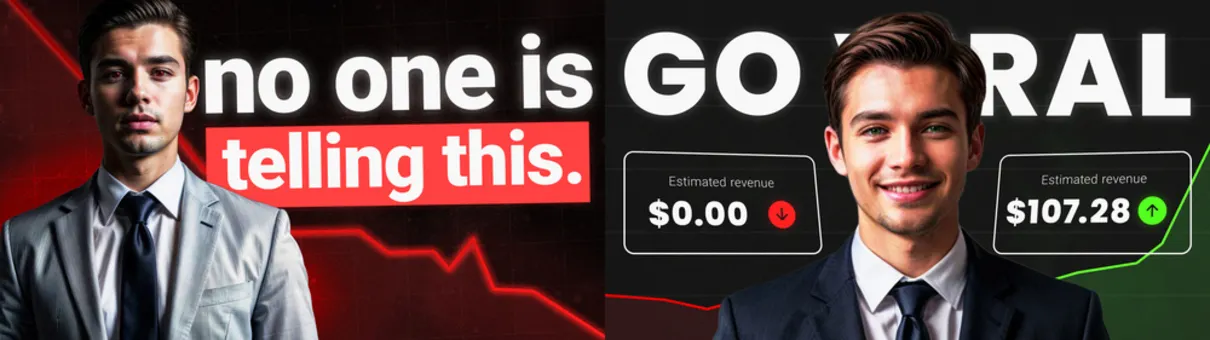
Quick headsup, as I obviously have no clients yet, I used some AI generated humans for these Designs, just imagine
these guys on the two thumbnails would be some good looking young youtube creators lmao
I would love to hear about your guys opinion to these designs! Feel free to hmu with constructive critisim too.
It's all much appreciated!
Best Regards
as I know there are a lot of talented GFX Artists here on BuiltByBit I wanted to try to get some feedback this way. Lately I try myself
a little bit more in YouTube Thumbnail Design. I have two Thumbnails I would like to show off to you guys & get some feedback!
Quick headsup, as I obviously have no clients yet, I used some AI generated humans for these Designs, just imagine
these guys on the two thumbnails would be some good looking young youtube creators lmao
I would love to hear about your guys opinion to these designs! Feel free to hmu with constructive critisim too.
It's all much appreciated!
Best Regards
Last edited:


